Italics — Where They Came From And What They Can Do.

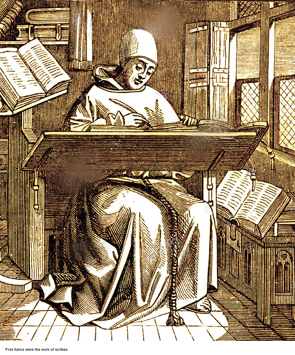
Italics are the aristocrats of type: elegant, beautiful, and dignified. Their history can be traced back to a time before there were fonts of type, when only scribes and the most educated communicated with letters. When they were first made into fonts, italics were designed to be the simplest of typographic tools for the most affluent readers.
A Little History
The story is told that Aldus Manutius commissioned the punch cutter, Francesco Griffo da Bologna, to develop a cursive type for a new series of small books that he was planning to produce. It is said that Manutius’ goal was to cut paper costs and thus make his publications less expensive. Saving paper, however, was not Manutius’ goal in the creation of italic type – and he never sold an “inexpensive” book.
Manutius’ italic type evolved from a popular writing style used by the educated. Its heritage can be traced back to Niccolo de Niccoli, an Italian scholar of the early 15th century. De Niccoli started to oblique and add flourishes to his letters when “he wished to write in a faster more relaxed fashion.” By the mid-century other scholars began to imitate his writing style, and by the late in the 15th century, italic became the official writing style of the educated, and professional scribes of southern Italy.

The cursive style of writing had been developed by the same scholars and learned government officials for whom Manutius’ created his books. In adapting the style to print, he was making books more appealing to their intended audience.
The first Italics were the most basic of fonts. They were designed as single-weight families and only contained lowercase characters: no caps, no numbers, and no punctuation. The idea was to use capitals and other characters as they became necessary, from whatever font the printer had available. It wasn’t until the 17th century that italics became a legitimate part of a type family and had slanted caps and numbers created as part of the offering.


Italics in the 21st Century
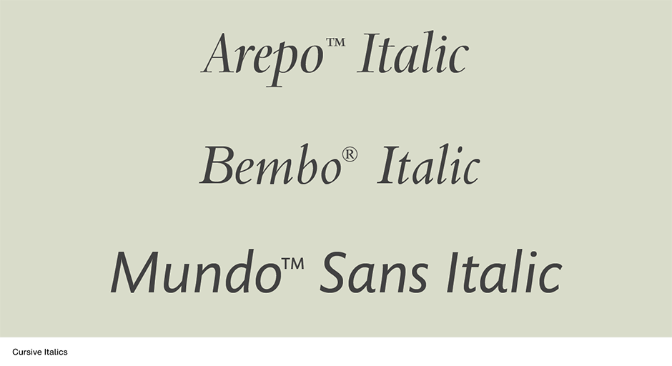
Show an italic typeface to typical readers and ask their opinion of the design and you’ll, more than likely, get responses like: “pretty,” “fancy,” or “decorative.” The logical design conclusion from this simple survey would be that italics are good designs to use when you want typography to be especially attractive, or arresting. Maybe not.
The problem is that italic fonts, especially the cursive variety, are too weak to be assertive. Readers may say that they think italics are attractive, but when it comes to reading them, studies have proved that italic fonts slow down the reading process by as much as 14 to 20 words per minute.
Italic types are also normally lighter in weight, and more condensed than their roman font counterparts. This delicate quality may add to their beauty but it detracts from an italic design’s ability to be a graphic emphasizer.
The Good News
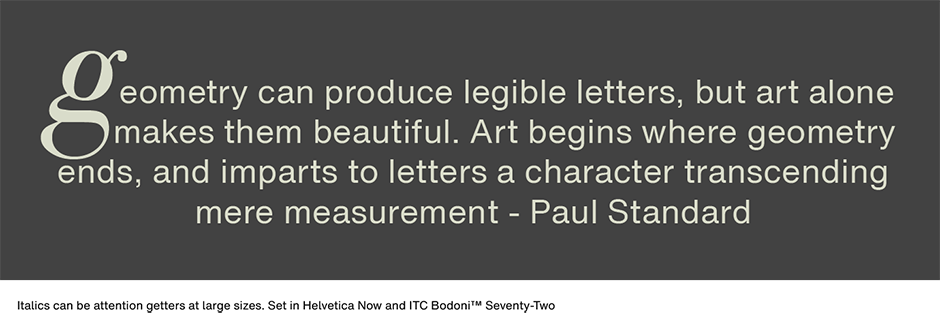
Italic typefaces, however, are beautiful communication tools that provide some very real typographic benefits. A word or two set in italic can create just the right mood in an ad or brochure. Italic subheads and pull-quotes set in a larger size than the text copy will enliven otherwise dull gray blocks of text, and provide a subtle form of emphasis. Captions set in italics can deliver their message without detracting from the photograph or illustration.
Italics make great initial letters – and not only the caps. Try a large italic lowercase letter as the introduction to an article, the results can be surprisingly arresting.

Letter Spacing
Italics are indeed the aristocrats of type, and some of our most beautiful communication tools. And while they should not be put to work without some consideration, they can be put to surprisingly creative use. And besides, as long as you’ve got them, you might as well use them.
Download a pdf version of the Italics - Where They Came From And What They Can Do article.


