Manual: Making Helvetica® Choices
Helvetica Now and Neue Helvetica rank first and second in MyFonts Best Sellers list – with the original Helvetica taking up the twelfth position.
“What’s going on?” one might ask. “Are they all the same design?” The answer is “yes” – and “no.”
Helvetica
Helvetica’s lineage can be traced back to the late 1800s, and a typeface called Akzidenz Grotesk, first released by the Berthold type foundry.
In the mid-1950s Edouard Hoffman, at the Haas Typefoundry in Switzerland, felt that a new version of the original design was in order. He approached the type designer Max Miedinger and together they produced the first weights of the new family. The result of their collaboration was released, as fonts of metal type, in 1957, as “Neue Haas Grotesk.”
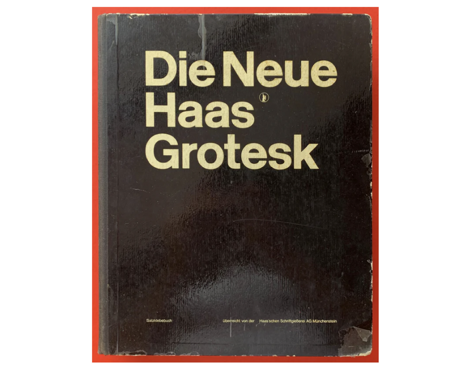
In 1961, Stempel, the German parent company of Haas, decided to offer the fonts to their customers. Stempel, however, felt that they would be unable to market a new face under another foundry’s name and looked for one that would embody the spirit and heritage of the face. They settled on “Helvetica” which was a close approximation of “Helvetia,” the name of Switzerland.
The first releases were just two Roman weights. Italics were created four years later. Succeeding weights and proportions were added to the Helvetica family over the next 20 years, growing it to over twenty different designs.
Neue Helvetica
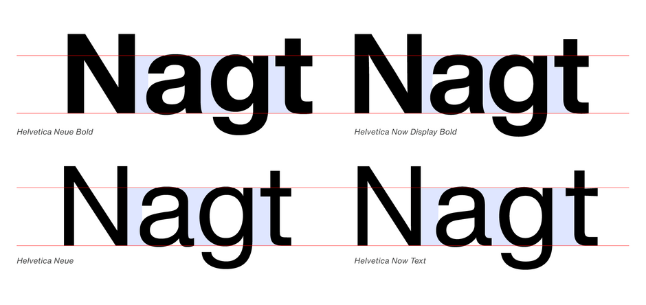
Neue Helvetica was drawn in 1983, as an updated and improved family of the original Helvetica. The different weights are more design consistent, and the family was built within a modern “system” of typefaces. There are sixty fonts in the Neue Helvetica family, plus large suites of international characters.
Helvetica Now
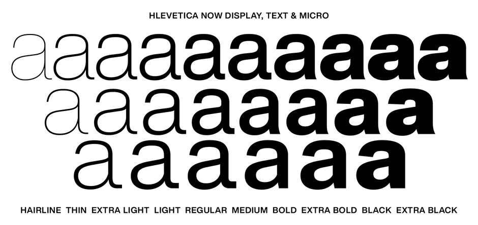
Helvetica Now is Monotype’s 21st-century reimagining of Helvetica, designed with improved legibility for digital and print uses, modern typographic refinements, and a range of optical sizes to ensure it performs beautifully in every context. The family contains 96 styles, in addition to two variable designs.
What you should know
If you want the newest and best version of a typeface family, go with the Helvetica Now design. If you’re looking to capture the flavor and idiosyncrasies of the hand- and machine-set versions of the typeface, pick Helvetica or Neue Helvetica
There is, however, an important caveat to using the newer Helveticas: If your client is using the earlier designs and you use one of the newer Helveticas, there is a strong likelihood that it will not match the weights, spacing or even the structural details of the original. If you want consistency and backward compatibility, you’ll need to stick with fonts of the original typefaces.
