Manual: Typography for Older Adults
According to the 2020 Census: 1 in 6 people in the United States were 65, and over. Current surveys show that 61% of those aged 65-74, use the Internet regularly.
That’s a lot of eyeballs.
Advancing age causes the pupils to shrink, creating vision problems in low-light environments. The eye’s lens also loses elasticity, becoming less able to focus while reading. In addition, age-related eye diseases cause blurred and sever vison loss.
If you want to reach an older audience, you’ll need to design for them.
Older adult-friendly design will make your typeset copy improve communication and not cause frustration. And it’s not that difficult to do. Follow a few simple guidelines and you can make reading a pleasure for an older audience – and enhance their understanding and absorption of your message.
Typestyle for Elderly
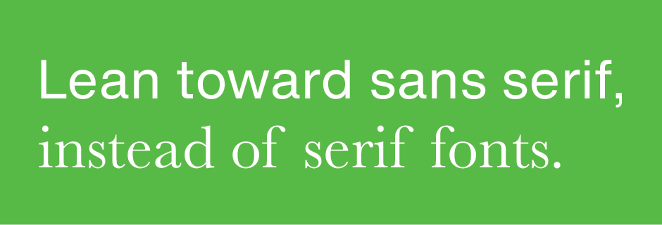
Use simple, easy-to-read typefaces; avoid scripts and decorative typestyles. Sans serif typefaces are easier to read, on screen, than serif designs. Keep the number of fonts per page to a minimum.
Type Size
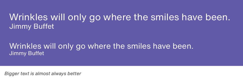
Keep text sizes generous – with extra line space to increase readability. A minimum of 12 point text with 14 points of line space is a good rule of thumb, although exact sizes can vary depending on the typeface.
Text Length
Avoid long blocks of text. Break copy into “snackable” chunks wherever possible. Take advantage of subheads, bulleted lists and boxes to organize and prioritize content.
White Space
White space helps reduce eye fatigue. Add space in the margins, between text sections and around graphics.
Emphasis
Use bold fonts to emphasize a word or a small group of words. Use italics to a minimum; research indicates that italic type is 18 percent more difficult to read than upright letters.

Color
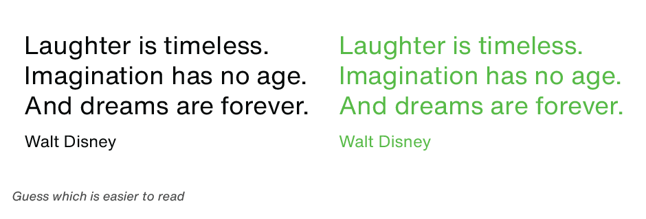
Black type on a white or very light background is the most accessible for older eyes. Avoid reverse or drop-out text, which is more difficult to read. Keep medium-value colors to a minimum.
Stick to the above guidelines, and you’ll be well on your way to capturing, and holding the attention of, that 61% of older Internet users.

