Select this license type when you are developing an app for iOS, Android, or Windows Phone, and you will be embedding the font file in your mobile application's code.
Borges
by PampaType
Individual Styles from $29.00
Complete family of 11 fonts: $249.00
Borges Font Family was
designed by
Alejandro Lo Celso and
published by
PampaType. Borges contains
1
styles and family package options.
More about this family
- Aa Glyphs
-
Best ValueFamily Packages
- Individual Styles
- Tech Specs
- Licensing
-
Borges Titulo Blanca
-
Borges Blanca Italica
-
Borges Gris Italica
-
Borges Negra Italica
-
Borges Super Negra Italica
-
Borges Titulo Hueca
-
Borges Blanca
-
Borges Gris
-
Borges Negra
-
Borges SuperNegra
Per style:
$22.63
Pack of 11 styles:
$249.00
Borges Titulo Set
2 fonts-
-
Per style:
$19.50
Pack of 2 styles:
$39.00
Borges SuperNegra Set
2 fonts-
-
Per style:
$24.50
Pack of 2 styles:
$49.00
Borges Negra Set
2 fonts-
-
Per style:
$24.50
Pack of 2 styles:
$49.00
Borges Gris Set
2 fonts-
-
Per style:
$24.50
Pack of 2 styles:
$49.00
Borges Blanca Set
2 fonts-
-
Per style:
$24.50
Pack of 2 styles:
$49.00
About Borges Font Family
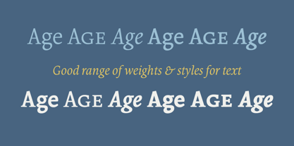
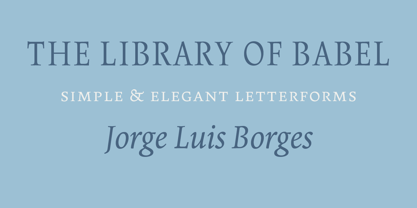
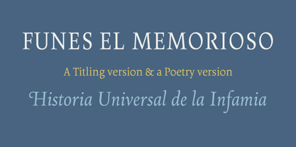
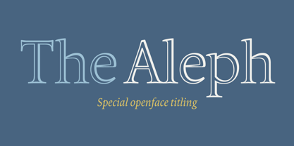
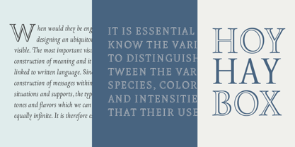
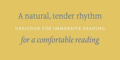
Borges is a versatile type family, inspired by the literature of Argentinian poet Jorge Luis Borges. It is a very legible & classic type designed with a contemporary feeling. Its delicate sense of rhythm delivers a comfortable legibility at reading. It was conceived for editorial use, though it is suitable for a variety of designs. Borges is composed of fifteen fonts: four full weights of roman, italic and small caps, as well as two titling fonts and an elegant chancery named Poema. Borges Titulo gained the Matthew Carter prize at the Morisawa awards, Tokyo 2002. Download print and screen specimens of Borges from PampaType.com. For a PDF file with more information on Borges, please click here Visit PampaType.com for more information.
Designers: Alejandro Lo Celso
Publisher: PampaType
Foundry: PampaType
Original Foundry: unknown
Design Owner: PampaType
MyFonts debut: Oct 26, 2004
Borges
About PampaType
PampaType was founded in 2001 by Alejandro Lo Celso with the idea of developing fine typefaces with a singular Latin flavor. Alejandro has worked as an art director in Buenos Aires, a professor in Mexico, and has studied type design in Europe. “Naturally your education and your beliefs all travel with you and are present in everything you do,” he said in his Creative Characters interview. “I think my experiences have made me more aware of the cultural context of things. Typography is a universe of subtle differences. So you need sharp intellectual tools in order to deal with its huge variety.” His letterforms are striking and adventurous; simultaneously useable and great fun.
Read more
Read less
- Choosing a selection results in a full page refresh.