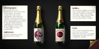
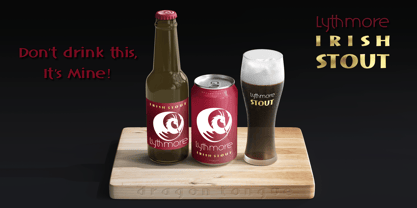
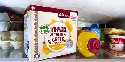
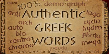
Skip to content
Home / Fonts / Dragon Tongue Foundry / DT Lythmore
DT Lythmore

DT Lythmore

by Dragon Tongue Foundry
Individual Styles from $9.00
Complete family of 16 fonts: $32.00
DT Lythmore Font Family was designed by Scott Spensley and published by Dragon Tongue Foundry. DT Lythmore contains 16 styles and family package options.

More about this family
FREE 30-DAY TRIAL of Monotype Fonts to get over 150,000 fonts from more than 1,400 type foundries. Start free trial
Start free trial

About DT Lythmore Font Family


Lythmore

This font is called Lythmore and is inspired by Lithos.

Lithos was originally designed for Adobe by Carol Twombly in 1990, based it on the lettering from ancient Greek inscriptions.


The Capitals are similar in feel and design, but is totally original and built from scratch.

It is designed to be similar intentionally, but it is not a clone or rip off.

Lithos is an example of a simple blocky san serif font style, with subtly concave sides, angled ends, and off centred curves.


Lythmore is also an example of that same style.

But is also different in places where I felt it could be improved. And it has a complete lower case set, which Lithos doesn't.

I built Lythmore with 8 different weights.


Lythmore can be very effective when used in advertising and general display work, but it can also be used for much more.

Although it was never designed to be body copy, when used as such, it is still perfectly readable and adds its own version of sans serif style and flavour.


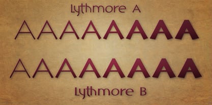
I have included two versions of the Lythmore family.

Lythmore A and Lythmore B.

In the Lythmore A family, the lighter 4 weights all vary in weight in both the horizontal and vertical axis. The heavier 4 weights all vary in the horizontal axis only.

In the Lythmore B family, the transition is even in both directions across the entire family.

The result of this difference is that the A and B versions difference is most noticeable between the Regular and Medium weights. While the extreme ends of each family version are virtually identical.

Designers: Scott Spensley

Publisher: Dragon Tongue Foundry

Foundry: Dragon Tongue Foundry

Design Owner: Dragon Tongue Foundry

MyFonts debut: Jan 5, 2022

DT Lythmore

About Dragon Tongue Foundry

Dragon Tongue Foundry. Scott Spensley from New Zealand, is the overall designer of all Dragon Tongue fonts. The foundry of Dragon Tongue came in to being around 40 years ago, to be a source of new music and graphic design ideas. The first real high quality digital font from this Foundry was created around 20 years ago. It was a digitised version of Scott’s wife’s calligraphy. It was stunningly good, and admired by all who saw it. It was never released. Sadly, after the his wife passed away from cancer, and multiple hard-drive crashes, the font was lost, and there are now no versions of it remaining. Dragon Tongue shut down for a period of time, but recently, with extra spare time created by Covid and lockdowns… the Foundry has re-awoken, and is focused totally on creating exciting new fonts, in multiple styles. Some of the current style directions are, Serif and San-Serif, Handwriting and script, hand drawn period, Art-Deco to 80’s, from serious high quality to funky and fun, extending the range of known font styles, and exploring modern adaptable fonts using contextual ligatures and Stylistic alternatives, swashes and ‘smart’ letters that adapt to their neighbours and position in a word or sentence. We aim to craft fonts that feel ‘clever’, as if it knows what the writer wants of it. Fonts that add a little bit more than a standard font does. In some cases, fonts that feel natural and alive. Feel free to check out some of his fonts that are yet to be released, at https://www.dragon-tongue.com/fonts

Read more

Read less