Select this license type when you are developing an app for iOS, Android, or Windows Phone, and you will be embedding the font file in your mobile application's code.
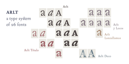
Arlt
by PampaType
Individual Styles from $29.00
Complete family of 25 fonts: $549.00
Arlt Font Family was
designed by
Alejandro Lo Celso and
published by
PampaType. Arlt contains
11
styles and family package options.
More about this family
- Aa Glyphs
-
Best ValueFamily Packages
- Individual Styles
- Tech Specs
- Licensing
-
Arlt Titulo Blanca
-
Arlt Titulo Blanca Italic
-
Arlt Titulo Negra
-
Arlt Titulo Negra Italic
-
Arlt Blanca Italic
-
Arlt Gris Italic
-
Arlt Negra Italic
-
Arlt SuperNegra Italic
-
Arlt Blanca
-
Arlt Blanca Versalita
-
Arlt Gris
-
Arlt Gris Versalita
-
Arlt Negra
-
Arlt Negra Versalita
-
Arlt SuperNegra
Per style:
$21.96
Pack of 25 styles:
$549.00
Arlt Text Family
11 fonts-
-
-
-
-
-
-
-
-
-
-
Per style:
$22.63
Pack of 11 styles:
$249.00
Arlt 7 Locos Family
7 fontsPer style:
$21.28
Pack of 7 styles:
$149.00
Arlt Titulo Family
5 fonts-
-
-
-
Per style:
$19.80
Pack of 5 styles:
$99.00
Arlt Negra Set
3 fonts-
-
-
Per style:
$26.33
Pack of 3 styles:
$79.00
Arlt Gris Set
3 fonts-
-
-
Per style:
$26.33
Pack of 3 styles:
$79.00
Arlt Blanca Set
3 fonts-
-
-
Per style:
$26.33
Pack of 3 styles:
$79.00
Arlt Titulo Negra Set
2 fonts-
-
Per style:
$24.50
Pack of 2 styles:
$49.00
Arlt Titulo Blanca Set
2 fonts-
-
Per style:
$24.50
Pack of 2 styles:
$49.00
Arlt SuperNegra Set
2 fonts-
-
Per style:
$29.50
Pack of 2 styles:
$59.00
Arlt Deco Set
2 fontsPer style:
$34.50
Pack of 2 styles:
$69.00
About Arlt Font Family
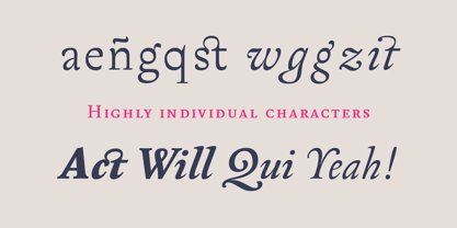
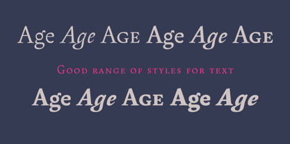
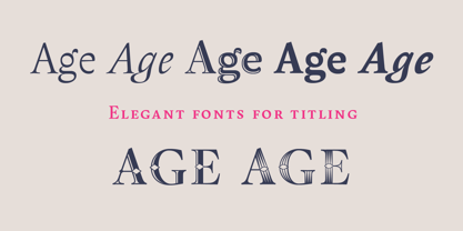
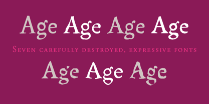
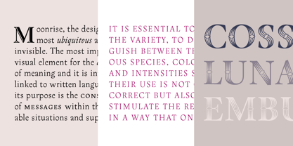
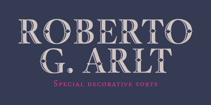
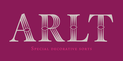
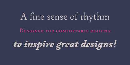
Arlt is a family of contemporary typefaces for a wide variety of applications. It includes text, display, and decorative fonts. Its style gives the text a sort of spicy atmosphere that makes it ideal for composing literature. Arlt has been created for the demanding, inspired designers. Being the result of 3 years of intensive work, the types aim to balance a strong personality against comfortable readability. The fonts have been carefully crafted in every detail, to offer you the highest visual quality standards in typography. Arlt is inspired by the novels and plays of Argentinean writer Roberto Arlt, active in the 20s and 30s. He pioneered the introduction of Lunfardo (Buenos Aires slang) into literature, and he was the first to write about the crook and the madmen. His novels and plays refreshed the spirit of Hispanic literature of early 20th century, and anticipated the work of English-speaking writers such as Irvine Welsh or William Burroughs. Arlt is a complex typeface. Its characters have vigorous counterforms. As individual shapes the letterforms can feel impulsive and capricious, but once they are combined into words, they look elegant and sober. The text line in Arlt creates a dynamic, stimulating rhythm, which is still very comfortable at immersed reading. Arlt is a contemporary interpretation of the alphabet which finds inspiration in some classic sources. The italics are linked to the glamorous, mannerist typography of 17th century Baroque (Dutch designer Christoffel van Dijck, Hungarian printer Miklós Kis). While the romans are a new attempt at capturing the warmth and vehemence of Expressionism. This style may be traced back to the 18th century: the singular work of German punchcutter Christian Zinck, and later to some 20th century East European type designers such as Preissig, Dyrynk, Menhart, and Frantisek Storm, probably today’s finest representative. Arlt includes 11 text fonts with roman, italic, and small caps in 4 different weights. The titling versions of Arlt include 4 delicate, space-saving fonts: romans and italics in two weights; and it also include a bold, elegant open face for special occasions (Arlt Titulo Hueca). The vigorous spirit of the text is slightly tempered in the titling versions for its use within bigger body sizes. Both text and titling versions of Arlt take advantage of valuable OpenType features: stylistic alternates for capitals and lowercases, some refined ligatures, and 4 different sets of figures (proportional oldstyle, proportional lining, tabular oldstyle, tabular lining). Small caps have their own figures design. Arlt 7 Locos is a series of seven irreverent fonts inspired by the harsh voices of the characters of the novel ‘Seven Madmen’, a celebrated piece by Roberto Arlt. Arlt 7 Locos fonts are based on the proportions and rhythmic qualities of the text romans, but their outlines have been carefully deconstructed, giving the text spicier and more expressive flavors. All 7 Locos fonts share the exact spacing and metrics, so they are interchangeable, with the advantage of leaving text’s flow untouched. These seven fonts are eye-catching at big sizes due to its expressiveness, but perfectly readable at tiny body sizes, so they offer you a variety of expressive voices and slightly rough textures, good for irreverent messages and slang tongues. Finally there is Arlt Deco. The obvious pun with ‘Art Deco’ just has to do with the natural difficulties of pronouncing correctly the name “Arlt” (it was actually so for Roberto Arlt himself). These two decorative fonts took much design and detail work, in particular Arlt Deco 2. Both are a contemporary reinterpretation of 19th century ornamental faces, mostly used in advertising, inscriptions, logos, posters. ‘Arlt Lanzallamas’ is the ultimate addition, a crazy font based on a dynamic cycle that makes the font jump among the Arlt 7 Locos fonts each time you type in a character. The length of the cycle is determined by the text line. It is fun to use it in any OpenType-sensitive app. See how how it works. Arlt text was prized by the Creative Review type contest, London 2006, and later the complete Arlt family was one of the Typographica favorites of 2008. PampaType wishes you an excellent design project with the Arlt typefaces.
Designers: Alejandro Lo Celso
Publisher: PampaType
Foundry: PampaType
Design Owner: PampaType
MyFonts debut: Mar 28, 2008
Arlt
About PampaType
PampaType was founded in 2001 by Alejandro Lo Celso with the idea of developing fine typefaces with a singular Latin flavor. Alejandro has worked as an art director in Buenos Aires, a professor in Mexico, and has studied type design in Europe. “Naturally your education and your beliefs all travel with you and are present in everything you do,” he said in his Creative Characters interview. “I think my experiences have made me more aware of the cultural context of things. Typography is a universe of subtle differences. So you need sharp intellectual tools in order to deal with its huge variety.” His letterforms are striking and adventurous; simultaneously useable and great fun.
Read more
Read less
- Choosing a selection results in a full page refresh.