Select this license type when you are developing an app for iOS, Android, or Windows Phone, and you will be embedding the font file in your mobile application's code.
PF Square Sans Condensed Pro™
by Parachute
Individual Styles from $79.00
Complete family of 12 fonts: $595.00

PF Square Sans Condensed Pro Font Family was
designed by
Panos Vassiliou and
published by
Parachute. PF Square Sans Condensed Pro contains
12
styles and family package options.
More about this family
- Aa Glyphs
-
Best ValueFamily Packages
- Individual Styles
- Tech Specs
- Licensing
About PF Square Sans Condensed Pro Font Family
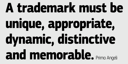
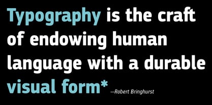
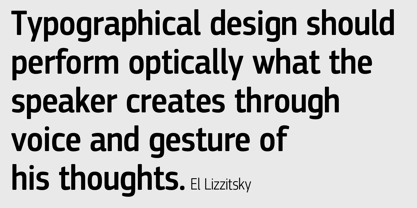
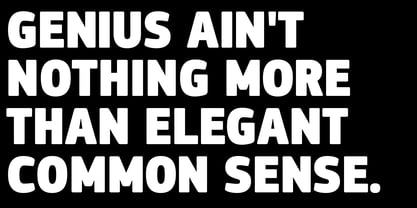
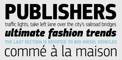
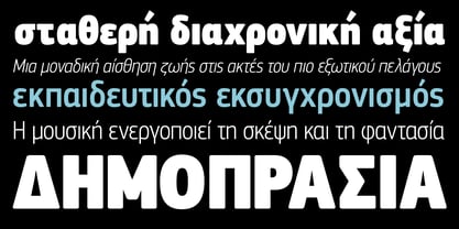
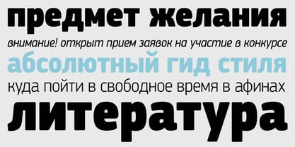
Square Sans Pro is one of Parachute’s most popular typefaces. It has been used by the likes of companies such as Samsung and organizations like the European Commission. Now a new version has been released. Square Sans Condensed Pro is a square-shouldered, modern and self-assured text typeface which lends style to a variety of projects. With its generous x-height, full-bodied counters and uniform stroke weight, it provides high legibility and uniform typographic color at all sizes. This is an exceptionally warm and comprehensive type family -with slightly rounded edges and softened curves- which possesses a robust and friendly appearance. The family consists of 12 fonts -from extrablack to thin- including true italics. It supports opentype features like small caps, fractions, ordinals, etc. and offers multilingual support for all European languages including Latin, Greek and Cyrillic. Download its complehensive PDF Specimen Manual for further details.
Designers: Panos Vassiliou
Publisher: Parachute
Foundry: Parachute
Design Owner: Parachute
MyFonts debut: Feb 21, 2014
PF Square Sans Condensed Pro™
is a trademark of Parachute and may be registered in certain jurisdictions.
About Parachute
Parachute is a digital type foundry and design agency, specialising in bespoke type design, corporate typefaces and lettering. We use the power of typography to transform living brands to global brands, enrich their identity and localise their language in emerging markets. Never content with the average, we manage to bridge the West with the East, the North with the South and combine tradition with innovation. We have collaborated with several leading organizations since 2001 and designed proprietary typefaces for some of the world’s most iconic brands and institutions such as Bank of America, Apple, European Commission, National Geographic, Ikea, Kraft Foods, UEFA, Samsung, Financial Times, Pernod Ricard, Ogilvy, Emirates.Our work has earned numerous accolades around the world with top honours from TDC, Red Dot, European Design Awards, Tokyo TDC, HiiiBrand, Granshan Awards, Communication Arts and many others.
Read more
Read less
- Choosing a selection results in a full page refresh.