Felbridge™ Font Field Guide

FOUNDRY: Monotype, DESIGNERS: Robin Nicholas & CLASSIFICATION: Sans Serif and Square Sans
Best Practices
The Felbridge typeface is a straightforward sans serif design with strong, clear letterforms that do not degrade in low resolution or on-screen environments. An added benefit is that these characteristics also make for a design that performs extremely well in traditional print applications.

FAMILY
Six weights of roman from thin to black. All have complementary italic designs.
Font Facts
- Italics were drawn in the tradition of being visually lighter than their related roman fonts.
- Robin Nicholas enjoys working in this garden which, for many years, was in the village of Felbridge.
Roots
The motivation behind the Felbridge family was to develop an ideal typeface for use in modest resolution on-screen imaging. To achieve this goal, Monotype Design Fellow, Robin Nicholas adjusted the interior strokes of complex characters like the M and W to prevent on-screen pixel build-up and improve legibility. Characters with round strokes were drawn with squared proportions to take full advantage of screen real estate. In addition, small serifs were added to characters like the I, j and l to improve both legibility and readability.
OpenType® Pro fonts of Felbridge contain three stylistic sets that provide alternatives for “serifed legibility characters” like the ‘I,’ ‘j’ and ‘i,’ in addition to a bowl-and-loop ‘g’ that can replace the single bowl design.

Legibility
Highly legible at large sizes and in blocks of textual print copy. Ideal for long form copy on small screens.
How To Spot Felbridge

Alternate Choices
Perfect Pairing
More Font Field Guides

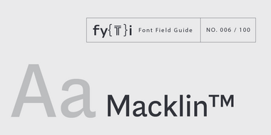
Macklin Font Field Guide
The Macklin family is a strong, adaptable family that is excellent for branding, headlines and other display uses. The simple shapes, open counters and apertures are wide and clear make it a good choice for short blocks of text copy in both print and on-screen environments. Learn more

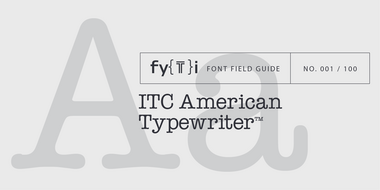
ITC American Typewriter Font Field Guide
The ITC American Typewriter typeface is a remarkably forgiving design in print, on screen uses and in under less than ideal reading environments. Its serifs, however, are quite long and can cause letters to link-up if copy is set too tight. Learn more


