Harmonia Sans™ Font Field Guide
Best Practices
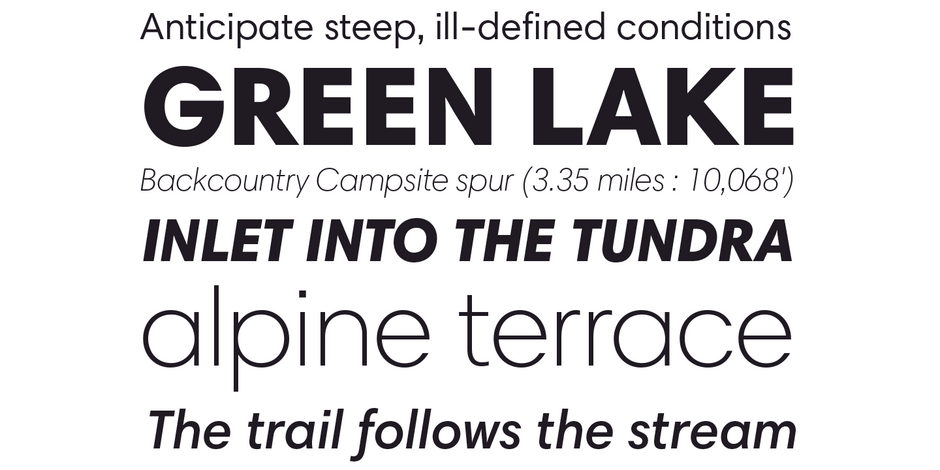
Harmonia Sans has a clean subtle modern up-to-date look. It is an excellent alternative to using dated geometric sans designs. The family contains a broad range of weights, widths, and language support, which makes it a complete solution for any virtually any design project, from high-resolution print and large-scale signage to low-resolution text displays and mobile devices.

Family
The Harmonia Sans family includes a total of 17 typefaces. Each of the five weights‚ ranging from light to black‚ has a companion cursive Italic. Wasco also drew condensed designs for the regular‚ semi bold and bold weights, in addition to four monospaced faces.
Font Facts
- Wasco’s design introduced a very “un-geometric” aspect into the letters of Harmonia Sans. “I decided to use classic proportions of calligraphic lettering in developing the design. I considered several examples before settling on the work of Ludovico degli Arrighi, a master calligrapher in the sixteenth century.” Arrighi typically used a ratio of five pen widths for lowercase to seven pen widths for capitals. Wasco’s x-height to cap height ratio in Harmonia Sans is also 5:7.
Roots
The name Harmonia Sans alludes to harmony in two realms, music and typography – and on two levels, the individual and the collective. Each musical note must be ‘right’ on its own, to ring true with the other notes in the phrase, and it must add to the composition as a whole. So it is with Harmonia Sans.

Legibility
The different alphabets were designed with maximum legibility in mind. Unique characteristics in Italic, Greek, Cyrillic and Monospaced letterform designs were maintained to differentiate them from the Roman.
How to spot Harmonia Sans


