ITC Benguiat® Font Field Guide

FOUNDRY: International Typeface Corporation (ITC), DESIGNERS: Ed Benguiat & CLASSIFICATION: Glyphic Serif
Best Practices
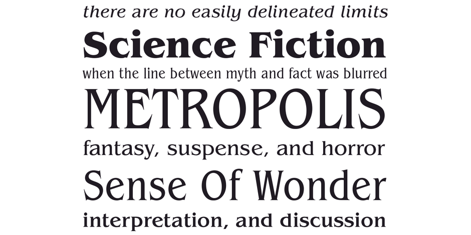
Originally drawn to be a display design, ITC Benguiat works best at large sizes. It’s also a distinctive design, and ideally used in short headlines and for branding.

FAMILY
Three roman and condensed weights, each with corresponding italics, plus a large suite of ligatures and alternate characters.
Font Facts
- Was initially rejected by ITC
- One of Benguiat’s favorite designs
Roots
A friend asked Benguiat to create a new logo for a store that he was opening. Benguiat provided the friend with dozens of ideas, but none were accepted. The friend finally chose a design – but the basis for ITC Benguiat was one of the rejected proposals. Undaunted, Benguiat kept working on the design and eventually submitted it to ITC.

Legibility
Sturdy proportions, a large x-height, open counters and distinctive character designs, make ITC Benguiat legible. Because the design is so distinctive, however, it can hinder message delivery in text sizes.
How To Spot ITC Benguiat

Alternate Choices
Perfect Pairing
Download a pdf version of the ITC Benguiat Font Field Guide and view ITC Benguiat.
More Font Field Guides

Centaur® Font Field Guide
A distinctive design that performs best at larger sizes in headlines and short blocks of text copy. Centaur should not be combined with equally distinctive designs. Learn more

Dante® Font Field Guide
Mardersteig designed his typefaces for letterpress printing. The ultimate triumph of the Dante design is that it now serves the diverse needs of digital text typography. Designed as a “book face,” Dante can be ideal for long blocks of text copy. Learn more


