Mont™ Font Field Guide

Best Practices
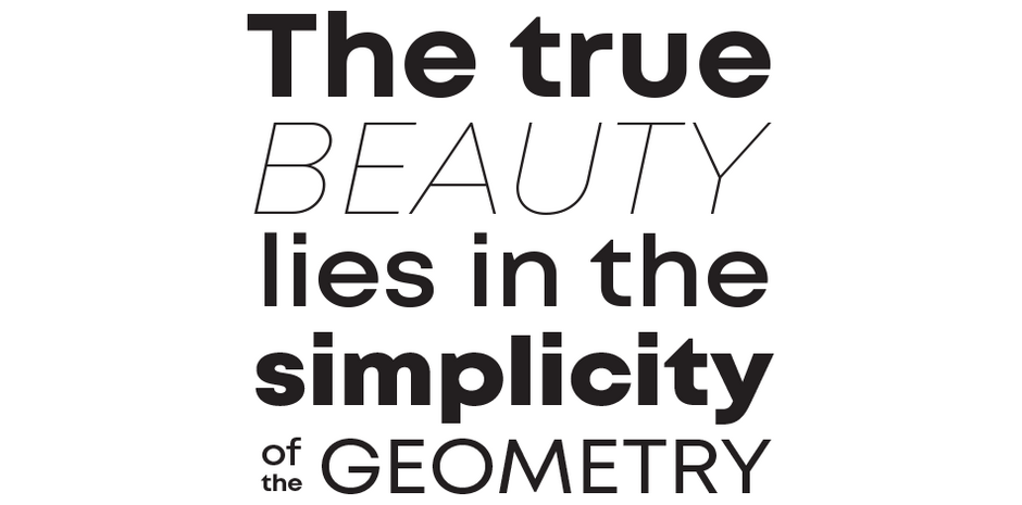
Mont is a versatile family that can be used at both large and small sizes. When used in headlines the typeface can be set in thin or heavy weights that displays the refined geometric forms at their extremes. In the smaller sizes and short paragraphs, Mont gives the text an overall sharp look and a clean, contemporary feel.

Family
The family contains 10 roman weights with corresponding italics and two free demos for the total of 20 fonts.
Font Facts
- Although Mont is a sans based on strict geometry, none of the letters feature a pure geometrical form. The team made numerous compensations and tests to ensure all characters are visually pleasing and fully functional
- Fontfabric’s diligent efforts on the constructive forms and beziers lead to the honorable award #1 Bestselling Typeface released in 2018.
Roots
The development of Mont started back in 2017 as an idea to design a functional and well-balanced design based on pure geometry. Svet Simov and his team explored the boundaries of the basic geometrical forms such as triangle, square, and circle – parts of which can be seen as a underlying forms in the final design.

Legibility
Mont’s low contrast and prominent x-height define its great legibility. The circular foundation of the round characters b, d, p, q, o, c, e contributes to a clean, modern geometric aesthetic.
How to spot Mont

Alternate Choices
Perfect Pairing
Download a pdf version of the Mont™ font field guide and view the Mont™ font family.
More Font Field Guides

Macklin Font Field Guide
The Macklin family is a strong, adaptable family that is excellent for branding, headlines and other display uses. The simple shapes, open counters and apertures are wide and clear make it a good choice for short blocks of text copy in both print and on-screen environments. Learn more

Futura® Now Font Field Guide
Spacing has a huge influence on legibility and reading comfort. Use the optical sizes to help tune that right away: Try Text styles for 18 pt. and below and use Headline styles above 18 pt. In general, very light or very heavy weights are best saved for headlines. Learn more


