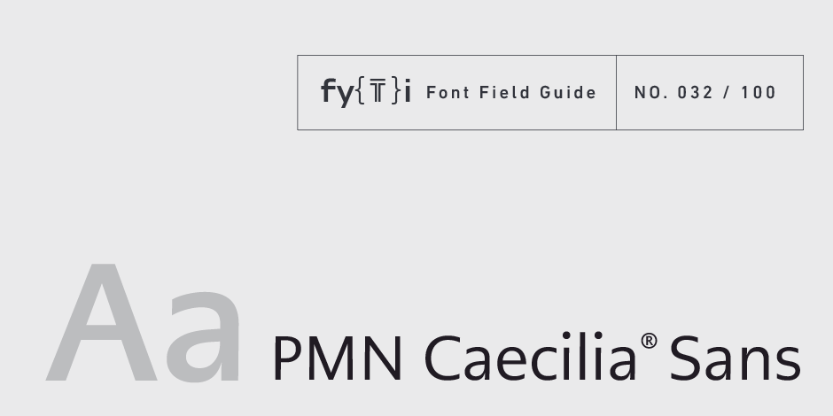
PMN Caecilia® Sans Font Field Guide

Best Practices
While individual characters, weights and basic structure are based on PMN Caecilia, PMN Caecilia® Sans is optimized for on-screen imaging. Web pages, blog posts, newsletters, UX design, etc. are all within its purview.

Family
A large family of seven weights, each with six stylistic variations of roman, italic, cursive, oblique and display versions of the roman and oblique designs, the family spans 42 designs.
Font Facts
- Cursive designs are, as the name implies, true italics with forms based in cursive lettering, while the obliques are subtle, slanted versions based on roman letterforms.
- Noordzij said he slanted the letters of PMN Caecilia Sans at an angle of .5 degrees because, “When you ride the bicycle in the Netherlands (where Noordzij lives), there is always a slight tail wind that you don’t feel.”
Roots
PMN Caecilia Sans began as an extension to PMN Caecilia, but was also designed to be independent typeface family with versatile possibilities in itself.
Noordzij, first, removed all of the serifs from PMN Caecilia and then revised the majority of characters. Knowing that the “typographic tone” would have to change, he made revisions with a focus on stroke widths and contrast, which is fundamentally different in a sans serif design.

Legibility
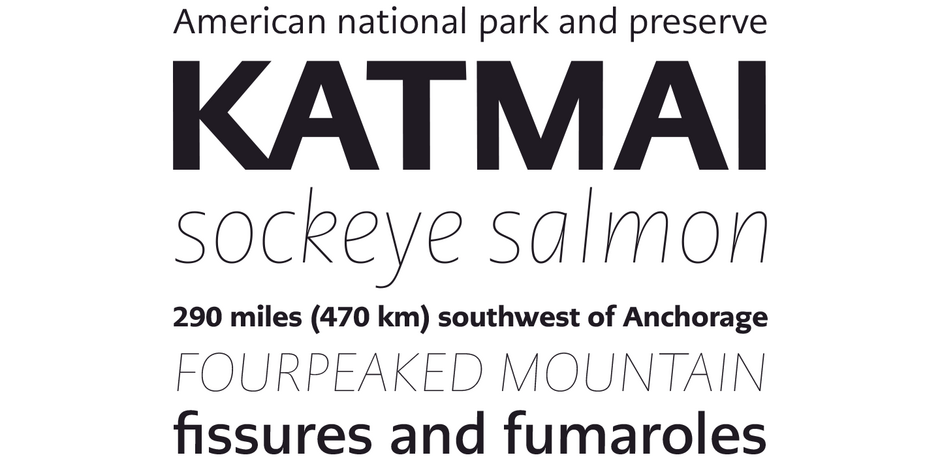
A Large x-height, open counters and generous apertures ensure high quality rendering at small sizes, and its humanistic proportions are comfortable for long-form reading. Low stroke contrast also improves legibility at small sized text.
How to spot PMN Caecilia Sans

Alternate Choices
Perfect Pairing
Download a pdf version of the PMN Caecilia Sans Font Field Guide and view the PMN Caecilia Sans font family.
More Font Field Guides

Visby CF Font Field Guide
Visby CF is versatile, and its different strengths come into play in different use cases. At large sizes, Visby has been used for headlines and logotypes. Due to its clean design, it also reads well at small sizes, making it an excellent choice for subtitles and captions – just be sure to track it out a bit to improve legibility. Learn more

ITC Legacy® Sans Font Field Guide
An excellent design for both hardcopy and interactive applications. The standard weights are full-bodied, while the condensed designs provide economy of space with little loss of legibility. Learn more


