Univers® Next Font Field Guide

FOUNDRY: Linotype
DESIGNER: Adrian Frutiger & Linotype design staff
CLASSIFICATION: Humanistic Sans Serif
Best Practices
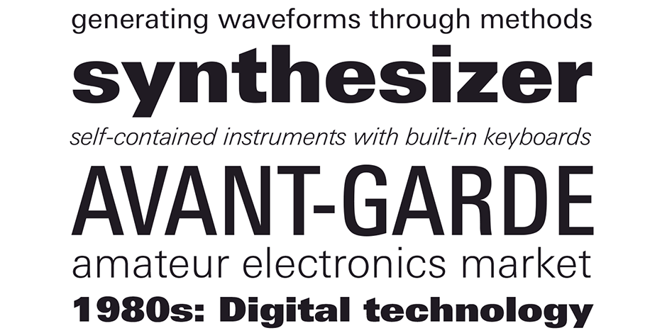
There are few applications outside of Univers Next range. It is an excellent choice for text and display content – in hard copy or on screen.

Family
Univers Next has 76 versions, including four monospaced typewriter designs. Arabic, Cyrillic and Pan European, in addition to variable fonts, are also available.
Font Facts
- The original Univers design was licensed to a wide variety of metal and phototype font providers. While each attempted to maintain absolute accuracy to Frutiger’s original drawings, because of the various and different requirements of the typesetting equipment that used the fonts, perfect replications were not possible.
Roots
Univers was the first typeface to be developed as a cohesive type family (with consistent weight and proportion changes) from its onset.
Originally released by Deberny & Peignot, through a series of acquisitions and licensing agreements, the family became part of Linotype in 1989.
Univers Next is a refined and updated version of the original Univers typeface family. All the existing weights of Univers were redrawn, with careful attention paid to making the proportions more consistent with each other and improving fine details, such as curves and thick-to-thin stroke ratios.

Legibility
Basic shapes translate well to a digital environment. Stroke terminals are parallel, or at right angles, to baseline – easiest to define in modest resolution. A slight squaring of the rounded shapes makes the most of digital real estate.
How to spot Univers® Next

Alternate Choices
Perfect Pairing
Download a pdf version of the Univers® Next font field guide and view the Univers® Next font family.
More Font Field Guides

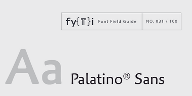
Palatino® Sans Font Field Guide
The characters in Palatino Sans based on written letter forms and the pressure of the hand. The lighter weighs can be excellent alternatives to many traditional serif and sans serif designs. Learn more

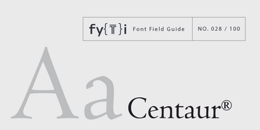
Centaur® Font Field Guide
A distinctive design that performs best at larger sizes in headlines and short blocks of text copy. Centaur should not be combined with equally distinctive designs. Learn more


