Manual: Six Guidelines for Type & Color in Publication Design
Color and text are two of the most powerful communication tools in publication design. Below are six simple guidelines that will help ensure that print publications are compelling, eloquent, and impactful.
1. Plan Color Usage from the Start
Incorporate color as an integral part of design rather than a mere embellishment. It should add value and be considered during the initial design phase. Whether for section heads or highlighting important information, a well-thought-out color palette enhances overall communication.
2. Use Color Sparingly
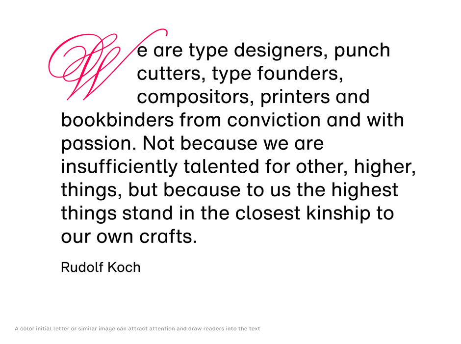
While vibrant colors can be enticing, overusing them can lead to visual clutter. Apply color judiciously; a simple drop cap or pull quote can successfully utilize color, while excessive use and result in graphic noise. Color’s rarity makes it powerful.
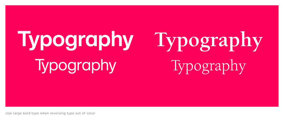
3. Maximize Contrast with Color and White Space
Just as white space is vital for effective design, so is concentrated color. Large, bold white text against a colored background will stand out more than smaller, colored text –enhancing readability
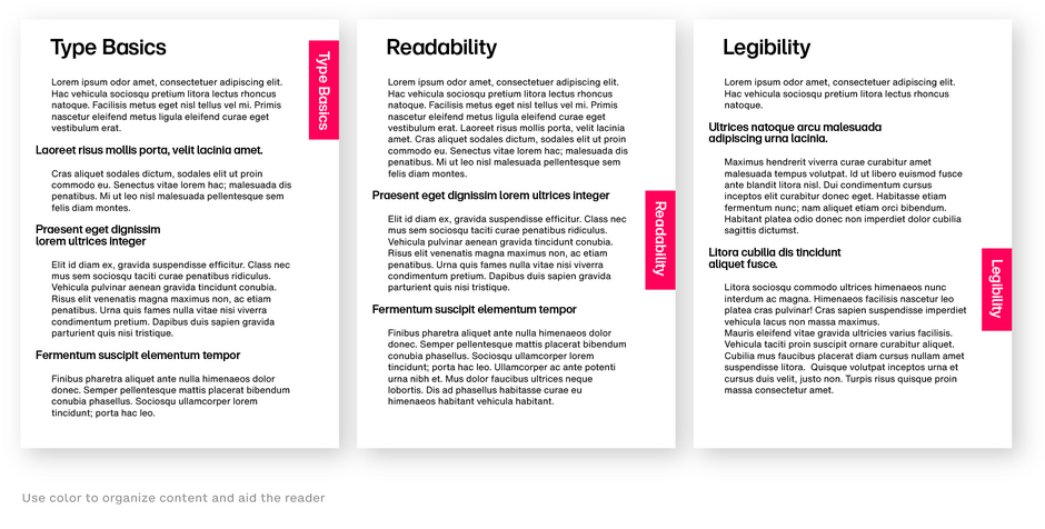
4. Use Color to Organize Content
Strategically implement color to identify and unify sections within your publications. This technique helps readers navigate lengthy documents by clearly delineating different parts – improving the overall user experience.
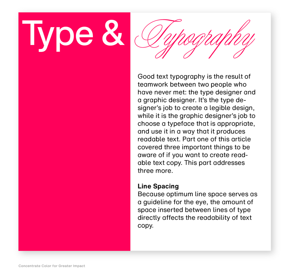
5. Concentrate Color for Greater Impact
Replace scattered color with concentrated blocks of color. Instead of using small, isolated patches, focus on a few large areas to enhance readability and create a more powerful visual impact.
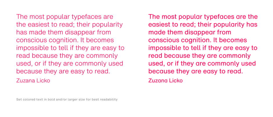
6. Enhance Visibility of Colored Text
When using colored text, make sure it is bolder and larger than standard black text. Colored text often has lower visibility and legibility, especially when italicized. Compensate for this by choosing bolder typefaces to improve readability
These guidelines can help you harness the power of color to create coherent and visually appealing publications that resonate with your audience.


