Skip to content
Home / Fonts / Sudtipos / Bibliophile Script
Bibliophile Script

Bibliophile Script

by Sudtipos
Individual Styles from $79.00 USD
Complete family of 2 fonts: $99.00 USD
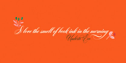
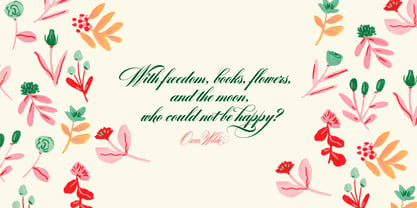
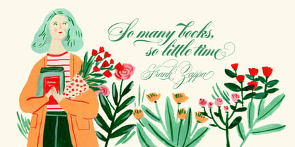
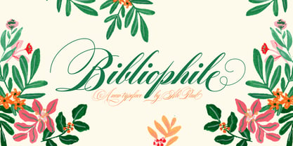
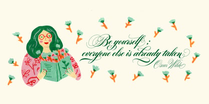
Bibliophile Script Font Family was designed by Alejandro Paul and published by Sudtipos. Bibliophile Script contains 2 styles and family package options.

More about this family
FREE 30-DAY TRIAL of Monotype Fonts to get over 150,000 fonts from more than 1,400 type foundries. Start free trial
Start free trial

Bibliophile Script Complete

2 fonts

Best Value!

Per style:

$49.50 USD

Pack of 2 styles:

$99.00 USD

About Bibliophile Script Font Family


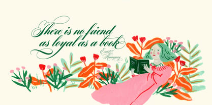
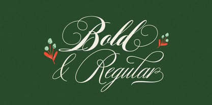
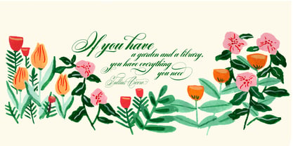
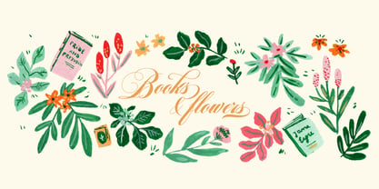
A friend once jokingly told me that what I really do is mine extinct arts for parts to use in modern things, like going to the scrapyard to pick up bumpers, quarter-panels and dashboards off of Datsuns and Ponies to build a shiny new Ferrari. I still kind of grin at that, but I certainly do spend a lot of time looking at old things and imagining ways they would work today. This shiny new Ferrari here is called Bibliophile, and it contains scrap heap parts from various pages by Louis Prang, the Prussian-American printer and publisher who inspired my Prangs fonts. This is my second engagement with the late 19th century man, and it’s quite a bit more intricate than just an italic Didone with a connected lowercase. Bibliophile marries Round Hand calligraphy with Italian capitals, two styles not often relayed in the same alphabet, but work together beautifully when combined well. When you combine them well with a few long-practised tricks of the trade, then mix in a few trusted features from my previous work over the years, you get my usual crazy exuberance, like 17 different shapes for the d, 21 different forms for the y, endings, beginnings, swashes, ornaments, and so on. It’s no secret that I can get carried away when I’m so consumed by an idea. — Bibliophile comes in 2 weights, each of them with over 900 glyphs covering all the latin languages. Bibliophile also comes with a bold weight, something I’m always reluctant to do with something as adventurous and complex as the structure of this historical mashup. But I couldn’t chase away the idea of increasing the contrast while maintaining the hairlines in a lowercase this narrow. Part of it was the curiosity about the outcome, and part was the sheer challenge of it. I think it turned out OK. Words set in either weight will show delicateness and elegance, and the more time you spend inside the font and micro-manage the setting, the more ways you will find to magnify either. Bibliophile can be as muted or luxurious as you want it to be. This is the kind of alphabet that fits well in fashion marketing and high-end packaging, from the very subdued to the super-exquisite. Enjoy the gleaming new vehicle made with freshly polished old parts.

Designers: Alejandro Paul

Publisher: Sudtipos

Foundry: Sudtipos

Design Owner: Sudtipos

MyFonts debut: Jun 7, 2017

Bibliophile Script

About Sudtipos

Sudtipos is a new collective Argentinian type foundry. New blood, new attitude. A joint venture of four professional designers with lots of expertise in different areas like branding, packaging design, corporate identity, television and new media. “The foundry, or collective as we prefer to designate it, started because of that — packaging, editorial or brand designers making fonts for real designers” Alejandro Paul, one of the company’s founders, said in his Creative Characters interview. Alejandro “Ale” Paul made a name for himself drawing and programming some of the most intricate script fonts ever digitized. “My experience in branding product packaging was a natural catalyst for me to be interested in scripts and seek like-minded people for the collective.” The collective’s bestselling scripts include Bowling Script, Horizontes Script and Hipster Script Pro, which was named one of MyFonts’ most popular fonts of 2012, and was recognized by both Typographica and Type Directors Club that same year. “Our aim is to always be graphic designers making typefaces for graphic designers,” Ale said. “We try not to lose that particular focus. We’re always thinking about how to make a graphic designer’s work easier when it comes to using the type element in his or her design.” The Premium Foundry Page can be viewed Here.

Read more

Read less