


Select this license type when you are developing an app for iOS, Android, or Windows Phone, and you will be embedding the font file in your mobile application's code.
Motorway
by K-Type
Individual Styles from $20.00 USD
Complete family of 6 fonts: $20.00 USD

Motorway Font Family was
designed by
Keith Bates and
published by
K-Type. Motorway contains
6
styles family package options.
More about this family
- Aa Glyphs
-
Best ValueFamily Packages
- Individual Styles
- Tech Specs
- Licensing
Basic typesetting
Letter case
Numerals and scientific typesetting
Typographic variants
Reset
Per Style:
$3.33 USD
Pack of 6 styles:
$20.00 USD
About the family
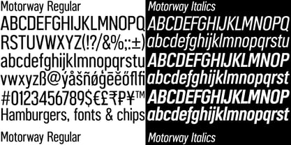
MOTORWAY is the companion typeface to TRANSPORT, the British road sign lettering. The Motorway alphabet was created for the route numbers on motorway signage, and is taller and narrower than the accompanying place names and distances which are printed in Transport.
However, for Motorway Jock Kinneir and Margaret Calvert created only the numbers 0 to 9, the capitals A, B, E, M, N, S and W, ampersand, slash, parentheses and a comma. So, although the lettering made its first appearance on the Preston bypass in 1958, K-Type Motorway is the first complete typeface and contains all upper and lower case letters, plus a full complement of punctuation, symbols and Latin Extended-A accented characters.
As with the Transport alphabet the starting point was Akzidenz Grotesk, Motorway taking inspiration from condensed versions. Changes were mainly driven by a quest for legibility, resulting in some reduced contrast between horizontal and vertical strokes, and Gill-esque straight diagonal limbs on the 6 and 9, and high vertex for the M.
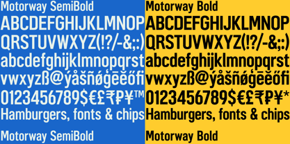
Kinneir and Calvert designed the limited range of characters in two weights; a SemiBold 'Permanent' weight for use as white letters on blue motorway signs, and a Bold 'Temporary' weight for heavier black letters on yellow non-permanent signage.
In addition to creating full fonts in both original weights, the K-Type family adds a new Regular weight, plus a set of italics, completing a highly usable condensed typeface which, while rooted in history, is fully functional for both print and web usage. The K-Type fonts are spaced and kerned normally, simply increase the tracking to recapture the generous spacing of motorway signage.
Designers: Keith Bates
Publisher: K-Type
Foundry: K-Type
Design Owner: K-Type
MyFonts debut: Apr 21, 2015
Motorway

About K-Type
K-Type is a small, independent type foundry based in Manchester England, offering a unique range of high quality fonts which are modestly and simply priced for designers, small businesses and large organisations.In addition to creating new typefaces resulting from formal experimentation, many K-Type fonts show the influence of inspirational artists and designers, many exploring the mix of insular and eclectic that has forged the typographical landscape of Britain and America.K-Type is also keen to make affordable fonts from styles which possess cultural currency or an existing social presence, generally redrawn to include comprehensive character sets containing a full complement of Latin Extended-A glyphs. New, previously unavailable weights and italics are often designed and added.
Read more
Read less