Creative Characters: Up and coming — Toshi Omagari
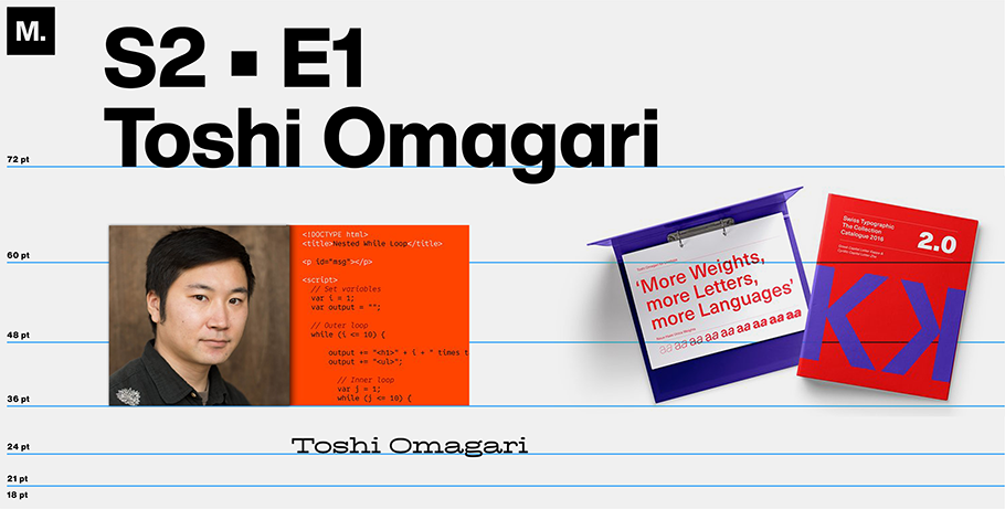
Japanese typographer, Toshi Omagari, 37, enjoys using the research skills he honed in adulthood to become an expert at what he loved growing up in 1990’s Fukuoka, Japan: video arcade games. Today, he’s more excited by arcade game typefaces than their plots. Recently, he became so fascinated by the look of fonts used by Nintendo, Super Nintendo, and others, that he penned Arcade Game Typography: The Art of Pixel Type, a book released shortly before the pandemic.
Since then, he’s left his longtime designing job for Monotype to become a freelancer in London, not far from where he earned his master’s degree in the University of Reading’s typography program. Currently, he’s developing what he calls, “totally original fonts,” but he won’t elaborate, saying of the burgeoning work, “Maybe it’s not at a stage where you can necessarily articulate what you’re making.”
To date, Toshi’s library of typefaces includes Codelia (a punny reference to Shakespeare’s “Hamlet”) and Comic Code. In a recent Zoom interview with Monotype, we discussed both fonts, as well as his love of challenges and diverse and casual type. Our conversation has been condensed for space.
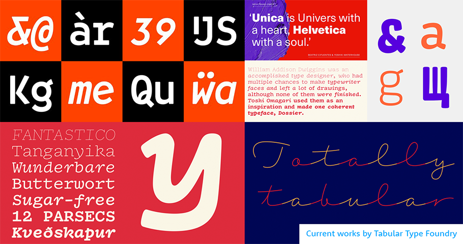
MyFonts: Your display text for your typefaces shows your sense of humor. Here, I’m thinking of your sample text for Codelia, “Python, and be silent,” as well as for Comic Code, “Coding with pyjamas on.” Did you ever think of becoming a writer?
Toshi Omagari: No, I don’t enjoy writing! I ended up writing a book about typefaces, but that took a LOT of time. In creating funny display text for Codelia and Comic Code, I wanted to say, “Hey, these typefaces aren’t really serious.”
MF: What do you mean by “not serious”?
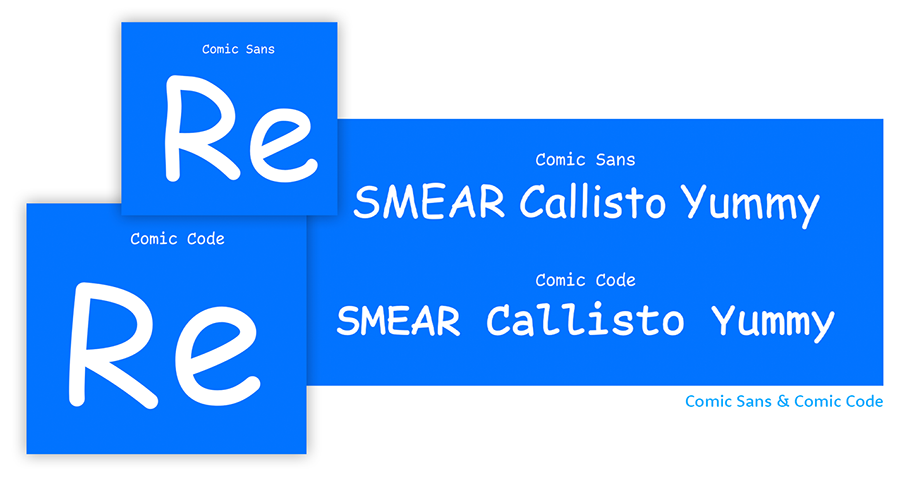
TO: I always want to make a typeface that challenges something in type design, like the “serious” idea that MS Comic Sans is bad. I want people to accept and enjoy Comic Sans — and challenge traditional notions in typography.”
MF: Why might Comic Sans be considered bad?
TO: It’s made to be used in a low-resolution screen of less than 1,000 pixels, so it’s best suited to school and home settings. But because it’s in Windows, everybody uses it, even though Microsoft Office is more of an adult program. But I don’t think there’s bad typeface, there’s only bad typography, or bad uses of typefaces.
MF: I guess I’m still not clear on why Comic Sans is “bad.”
TO: To some, it may look too casual, too childish. The spacing of the characters is very irregular — straight, not straight; round, not round. If you think about Comic Sans like handwritten shapes, the writer has absolutely no control; like a child learning to write.
MF: Anything else you’d like to challenge?
TO: Well, because I design lots of scripts that I’m not native to (I’m Japanese, yet I don’t design Japanese ideographs) but instead things like Latin, Tibetan, Mongolian, Arabic, I’m always keen to push multi-culture, multi-script design. When designers discuss typography, it sometimes makes me laugh, because most mean Latin typography (employing the 26-letter alphabet beginning with ABC), but they skip the “Latin” prefix. When I hear things like this I say, “You’re talking about Latin! You should say Latin!”
MF: Do you think most are aware that they’re designing in Latin?
TO: Not unless they design in other scripts. Typography exists in basically every culture. But if you attend conferences or presentations and people say, “This is the way you should approach typography,” that might not apply to Middle Eastern typography or Japanese typography. I think we should be more specific.
MF: What made you decide against designing in Japanese ideographs?
TO: If you open a Japanese font, or Chinese or Korean font, their character counts are in the tens of thousands. When you’re talking about a Latin font, that’s easily in the hundreds. You can assume that designing in CJK (Chinese, Japanese and Korean) probably takes at least 10 or 100 times longer.
MF: Are the characters more complex?
TO: It’s more like every word in the dictionary exists as one character representing a concept or a thing, rather than word sounds. A smiley face emoji, for example, is an ideograph.
MF: Do you have a favorite font?
TO: From my own typefaces? It depends on when you ask. If you ask me tomorrow, you might get a different answer.
MF: Tonight at 10 pm in London, which font of yours are you feeling most fond of?
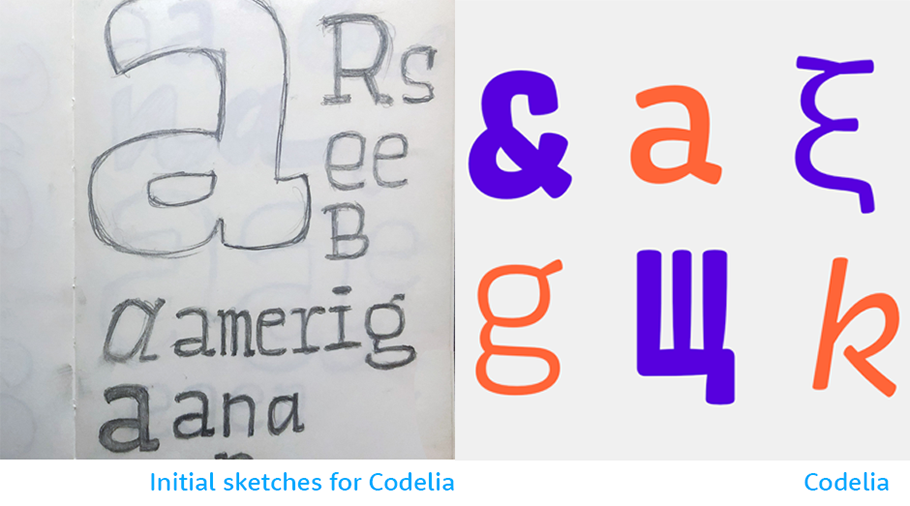
TO: Codelia, because of what I believe about programming. Codelia’s a really, soft, casual typeface, made for programming. Code’s in the name. And code —machine-like rows of characters — looks scary to many people. I want to change that.
MF: What do you hope to do in the future?
TO: Make a typeface that supports my life? I don’t know. Make a big hit? Why not!
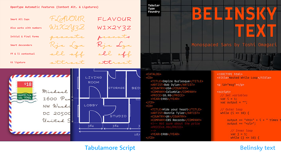
Take a look at fonts by the Tabular Type Foundry.
We hope you enjoyed this interview. Checkout previous interviews of up and coming creative characters.


