


Select this license type when you are developing an app for iOS, Android, or Windows Phone, and you will be embedding the font file in your mobile application's code.
Manus Smooth
by JOEBOB graphics
Individual Styles from $25.00 USD

Manus Smooth Font Family was
designed by
Geert Dijkers and
published by
JOEBOB graphics. Manus Smooth contains
1
styles.
More about this family
About the family
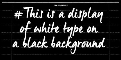
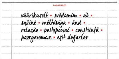
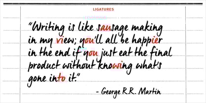
The Manus font family is extended with a new relative: Manus Smooth. Some major and minor adjustments were made, but it still has the look & feel of the original.
Designers: Geert Dijkers
Publisher: JOEBOB graphics
Foundry: JOEBOB graphics
Design Owner: JOEBOB graphics
MyFonts debut: Oct 24, 2017
Manus Smooth

About JOEBOB graphics
At JOEBOB graphics we like to write. And we like to keep it real.We create our handwritten fonts in such a way that they end up looking like handwriting, not like polished scripts. We do so because we think it’s a good idea to establish a natural feel to our fonts and aim for character and intention over perfection. Little flaws we make while writing are welcomed and left in on purpose because we think it contributes to the idea of bein...
Read more