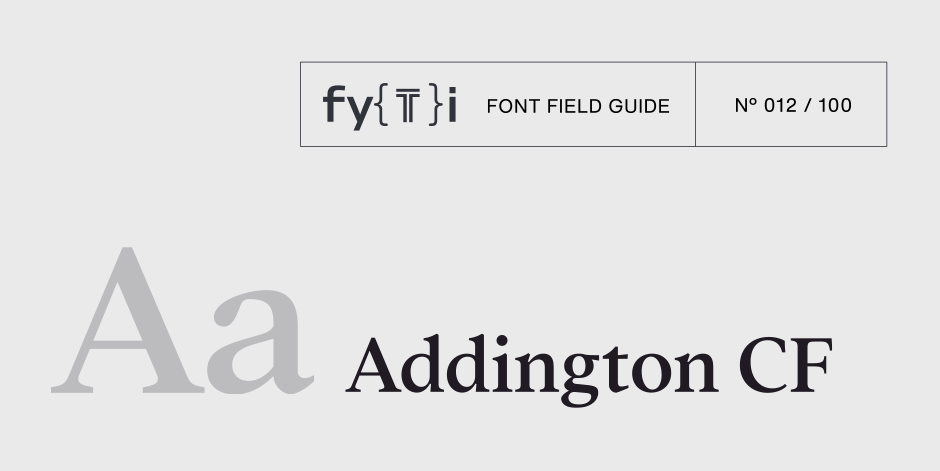
Addington CF Font Field Guide

Best Practices
Addington CF is built for use at small to medium sizes, in print and digital environments. Its middle weights are designed for use in longform text, articles, books, footnotes, and documents. The thicker weights can double as headlines, subheadlines, and captions, especially when tracked tightly, while thinnest weights shine at very large sizes – great for wordmarks and posters.

Family
Seven weights of roman designs, each with a complementary italic, for a total of 14 styles.
Font Facts
- Addington is Connary Fagen’s second serif typeface release after Quincy CF, building on the experience learned from Quincy’s development.
- Addington is the name of village England. The name was chosen for this typeface for its pleasant sound and imagery, matching the look and feel of the typeface.
Roots
Addington CF is an original design by Connary Fagen created in 2016. 16th century old style typefaces and the later transitional period provided foundational inspiration. The desired effect was a pleasant, beautiful typeface that worked hard and got out of the way, quietly elevating and uplifting any work Addington is used in.

Legibility
Addington CF was designed for text use, and reads well at small to medium sizes. Moderate stroke contrast and a balanced x-height help make Addington a reliable workhorse in text-heavy applications.
How to spot Addington CF

Alternate Choices
Perfect Pairing
Download a PDF version of the Addington CF Font Field Guide and view the Addington CF font family.
More Font Field Guides

Novaletra Sans CF Font Field Guide
Novaletra Sans CF is built to excel at small to medium sizes, in print and digital environments. Perfect for text, captions, books, and documents, Novaletra’s elegant construction helps text flow and is easy to read, even at very small sizes. Learn more

Cygnet CF Font Field Guide
Cygnet CF is best when used in large to medium sizes. Though it reads well at smaller sizes, its unique flourishes and cheerful character are more evident when given space. Learn more


