Avenir® Next Font Field Guide

Best Practices
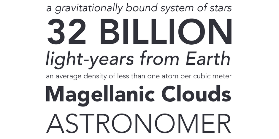
The design of Avenir Next is clean, straightforward and performs with confidence in long blocks of text copy and headlines. It also pairs well with well with so many contemporary serif text typefaces.

Family
The Avenir Next family contains 32 designs: eight weights ranging from UltraLight to Heavy of roman and italic, in normal and condensed proportions.
Font Facts
- Avenir Next has subtle foundational stress throughout the family
- The Georgian version of Avenir Next has a shorter x-height and a greater ascender height to enable the complex shapes and tall ascenders.
- Avenir Next Variables are font files which feature two axis, weight and width. They have a preset instance from UltraLight to Heavy and Condensed to Roman width.
Roots
In drawing Avenir, Adrian Frutiger looked to both the past and the future for inspiration. His goal was to reinterpret the geometric sans serif designs of the early part of the 20th century in a typeface that would portend aesthetics of the 21st century.
Avenir was released in 1988, in three weights – each with a roman and oblique version. In 2004, Frutiger, in close cooperation with Akira Kobayashi, completely reworked the design, and added new weights to the family.

Legibility
Letters may look perfectly round, but are actually slightly flattened on top and bottom – a shape that creates a horizontal stress and improved readability. Open counters, and horizonal stress make Avenir Next ideal for print and on-screen content.
How to spot Avenir® Next

Alternate Choices
Perfect Pairing
Download a pdf version of the Avenir Next font field guide and view the Avenir® Next font family.
More Font Field Guides

Neue Haas Unica™ Font Field Guide
There are few applications outside the range of Neue Haas Unica. It is an excellent choice for text and display content – in hard copy or on screen. Learn more

Mont™ Font Field Guide
Mont is a versatile family that can be used at both large and small sizes. When used in headlines the typeface can be set in thin or heavy weights that displays the refined geometric forms at their extremes. Learn more


