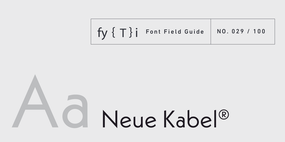
Neue Kabel® Font Field Guide

Best Practices
Neue Kabel has a strong personality that limits its use in long form text. It can be, however, an excellent choice for advertising copy, promotional material, catalogs and brochures in print and on screen.

Family
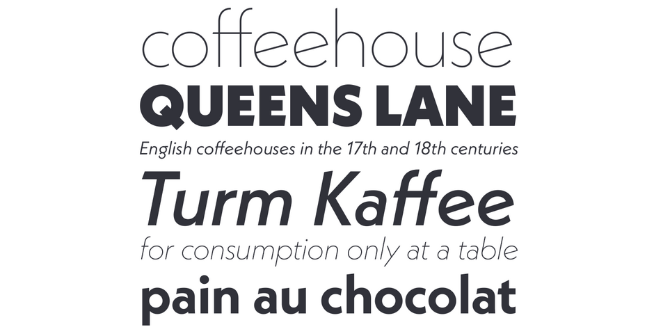
Neue Kabel family consists of nine weights of roman designs, each with an italic counterpart.
Font Facts
- The geometric characteristics of Kabel were the result of an experiment of sorts: an odd experiment for Koch, who prided himself on his calligraphic ability. In his words, “the task of creating a type with a pair of compasses and a straight edge has always attracted me.”
- Koch based his character proportions on artistic sensibilities and even, perhaps, on a creative whim or two. Character shapes and proportions can be traced to ancient Greek lapidary letters, Venetian old style type designs, and calligraphy.
Roots
The Neue Kabel typeface family takes the calligraphic charm of Rudolf Koch’s 1927 design and ushers it into the 21st century. The original typeface was first released as just one weight and grew to a family of 9 designs over several years. Unlike most contemporary typefaces, however, the various versions of the first Kabel family were dissimilar in proportion and suffered from varying character traits.

Legibility
Neue Kabel is primarily a display typeface and works best in large sizes, An ample lowercase x-height, large counters, generous apertures and moderate contrast in character stroke thickness, however, combine to give Neue Kabel good levels of legibility in text sizes.
How to spot Neue Kabel®

Alternate Choices
Perfect Pairing
Download a pdf version of the Neue Kabel Font Field Guide and view the Neue Kabel font family.
More Font Field Guides

Articulat CF Font Field Guide
Articulat CF is built for use at medium sizes, in print and digital environments. It excels in digital spaces, including the web, user interfaces, games, and informational displays. Learn more

Artifex Hand CF Font Field Guide
Artifex Hand CF is built for use at small to medium sizes, in print and digital environments. Its Book weight is designed for use in longform text, articles, books, footnotes, and documents, while the thicker weights can double as headlines, subheadlines, and captions. Learn more


