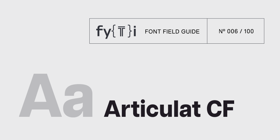
Articulat CF Font Field Guide

Best Practices
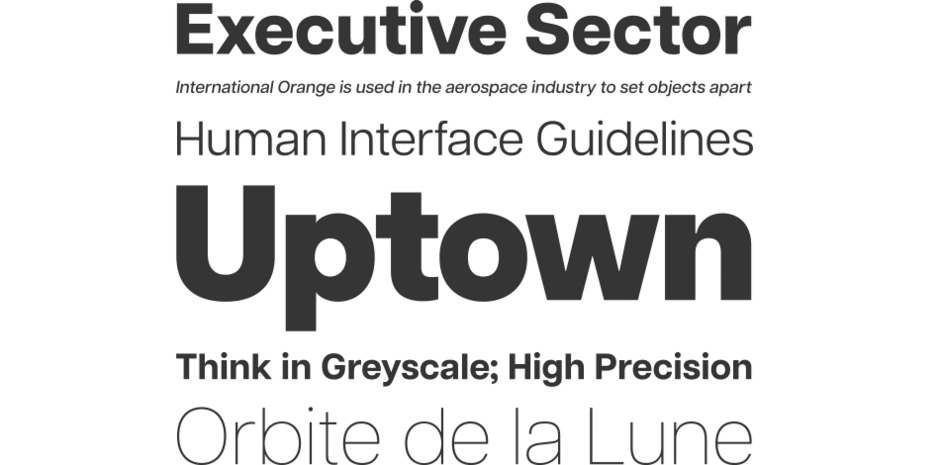
Articulat CF is built for use at medium sizes, in print and digital environments. It excels in digital spaces, including the web, user interfaces, games, and informational displays. The bolder weights look great as headlines, and pairs perfectly with smaller text set in the middle weights. With ten weights and support for both Latin and Cyrillic scripts, Articulat is up to the task for a wide range of applications where a professional, stark mood is desired.

Family
Ten weights of roman designs, each with a complementary oblique, for a total of 20 styles.
Font Facts
- Articulat CF has the most weights of any of Connary Fagen’s type families, at 10 weights with accompanying obliques.
- Despite its straightforward and unassuming design, Articulat is one of Connary Fagen’s most widely used typefaces, and among the foundry’s earliest and most enduring releases.
Roots
Articulat CF is an original design by Connary Fagen initially created in 2015, with major updates in 2016 and 2020. Midcentury design in all its forms – architecture, graphics, furniture, type – had long captivated Connary even before entering the industry, so it was only a matter of time before he would design his own take on the concept. Compared to other midcentury-inspired typefaces, Articulat hews closer to geometric shapes, lending a futher sense of precision and coherence, hence the (oddly spelled) name.

Legibility
Unadorned and simple, Articulat CF reads well at any size. A slightly taller x-height and straightforward construction create a robust design that holds up well in less than ideal conditions, including low resolution digital applications.
How to spot Articulat CF

Alternate Choices
Perfect Pairing
Download a pdf version of the Articulat CF Font Field Guide and view the Articulat CF font family.
More Font Field Guides

Quiverleaf CF Font Field Guide
With delicate shapes and an airy, light design, Quiverleaf CF does best when used as a display typeface. For very large text, including logos and posters, the lighter weights can be used for the most dramatic visual effect. In bolder weights, Quiverleaf is a striking choice for headlines and other short texts. Learn more

Artifex Hand CF Font Field Guide
Artifex Hand CF is built for use at small to medium sizes, in print and digital environments. Its Book weight is designed for use in longform text, articles, books, footnotes, and documents, while the thicker weights can double as headlines, subheadlines, and captions. Learn more


