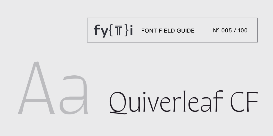
Quiverleaf CF Font Field Guide

Best Practices
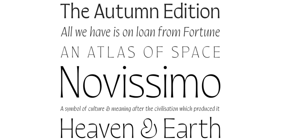
With delicate shapes and an airy, light design, Quiverleaf CF does best when used as a display typeface. For very large text, including logos and posters, the lighter weights can be used for the most dramatic visual effect. In bolder weights, Quiverleaf is a striking choice for headlines and other short texts. Though its shapes are clean and defined enough to survive poor print quality, Quiverleaf truly excels in high quality print and digital settings where its fine details and stroke contrast can shine through. The italic set is narrow and near-upright, lending an elegant tension to italicized text where desired.

Family
Five weights of roman designs, each with a complementary italic, for a total of 10 styles.
Font Facts
- Quiverleaf CF began as an experimental side project and was developed on an already-then-vintage 2012 MacBook Pro, in part to test its legibility on low-resolution displays.
- “Quiverleaf” is another name for the quaking aspen, the most widely distributed tree in North America and commonly seen in the Rocky Mountains where Connary lives.
Roots
Quiverleaf CF is an original design by Connary Fagen created in 2021. The concept for the typeface came as Connary was experimenting with the idea of a ribbon moving fluidly to create letterforms. After some initial experimentation the final design flowed quickly, including the condensed italic set. Quiverleaf Arabic CF, an Arabic-script adaptation, followed in 2022 as the second Arabic-script typeface to be released by Connary Fagen.

Legibility
Quiverleaf CF is primarily designed for display use, with legibility best at medium to large sizes. The open construction of its shapes hold up at small sizes, but due to its thin lines, Quiverleaf reads best when used as an eye-catching accent, such as headlines.
How to spot Quiverleaf CF

Alternate Choices
Perfect Pairing
Download a pdf version of the Quiverleaf CF Font Field Guide and view the Quiverleaf CF font family.
More Font Field Guides

Vary™ Font Field Guide
Vary is at its best in large sizes. Each variation brings its own personality to the eclectic family. Use Vary when you want to make a statement. This is not a “crystal goblet” kind of design. Use it for headlines, branding and packaging. Learn more

Aglet Sans Font Field Guide
Aglet Sans is intended for text to display sizes, both in print and on screen. It is spaced more towards display use, so very small point sizes will need a touch of tracking to read best. Learn more


