Text Ligatures Manual.

Ligatures were one of the first typographic tools. They’ve been around since Johann Gutenberg came up with the idea of automating calligraphy. He designed and used ligatures for the same reason as the scribes before him – to enable a column of text copy to align on both the right and left margins. Gutenberg made scores of ligatures for his fonts. They were special pieces of metal type that combined two (or sometimes three) letters into a single character to save space.
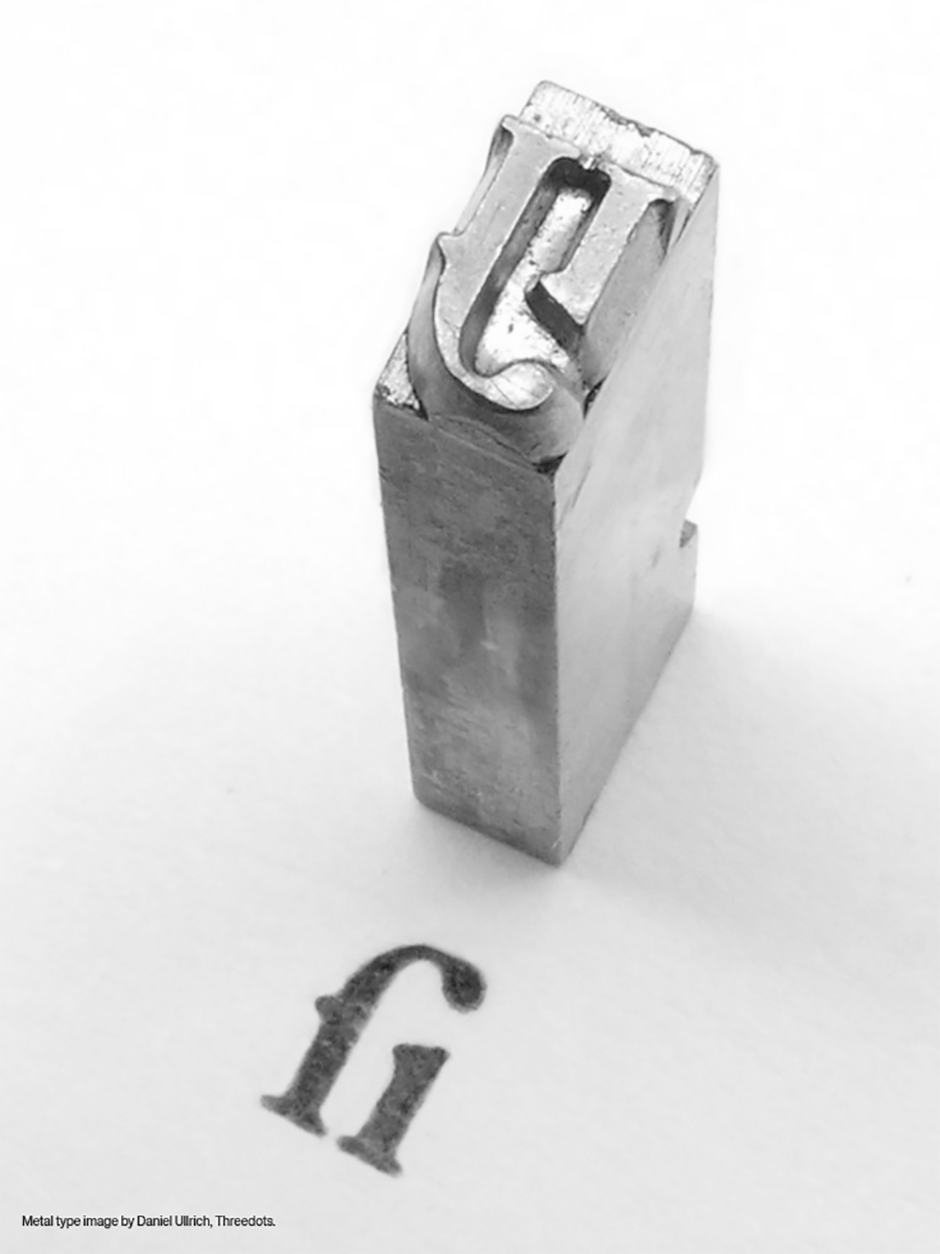
Designed by: Daniel Ullrich, Threedots
Ligatures continued to be an active ingredient in printer’s fonts after Gutenberg, but not to the same levels of completeness. Scores were reduced to a dozen or so. These ligatures also saved space – and made setting type by hand easier. The most common were the f-ligatures: fi, fl and sometimes ff, ffi and ffl – letters that were commonly used together. Diphthongs (compound vowel characters, such as æ, were also relatively common ligatures. In addition, ligatures were created to prevent the unattractive collision and inconsistent spacing that occurs in some typefaces between the hook and/or crossbar of the f and the dot or serif of the “i”, or the ascender of the “l” or second “f”.
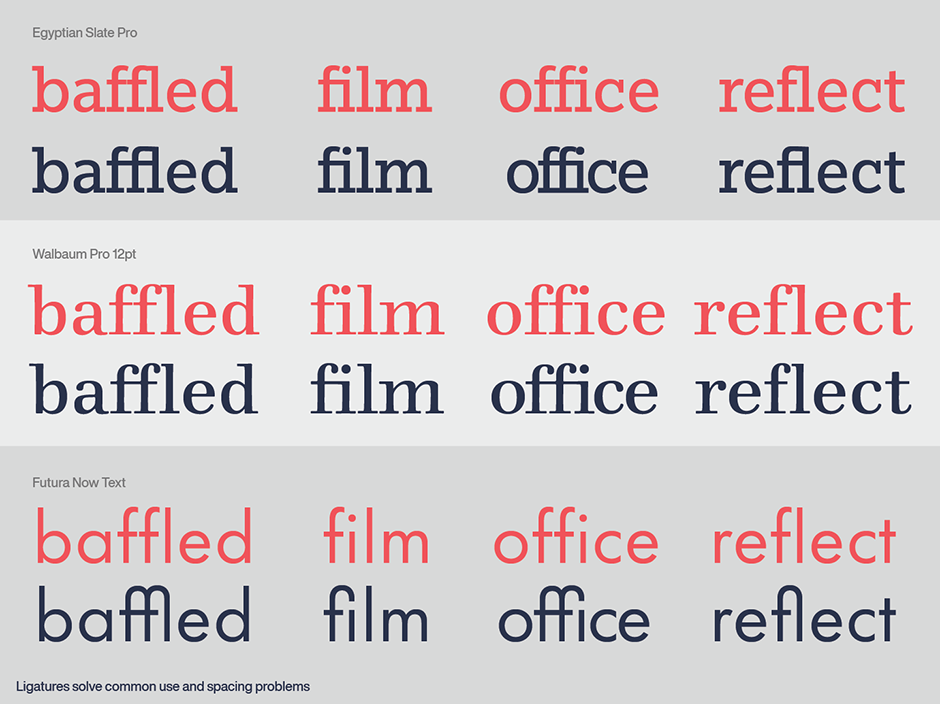
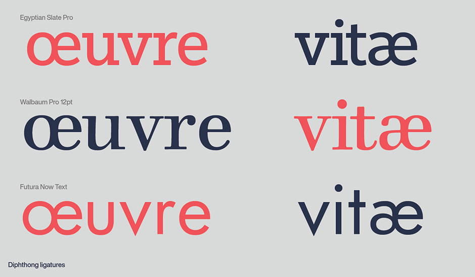
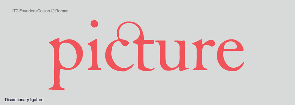
When machine-set type replaced setting type by hand, ligatures did not make the cut, and were dropped from the typographic team. Ligatures came back into the picture with phototype fonts, and flourished with digital fonts. Discretionary ligatures were also added to the mix. These are generally more decorative in nature than a standard ligature. Some discretionary ligatures combine frequently occurring letter pairs, like Th, into a single graceful design. Other ligatures, such as the ck, ct and st combinations found in faces such as ITC Founder’s Caslon™, originated from historical usage and can add a touch elegance to text copy.
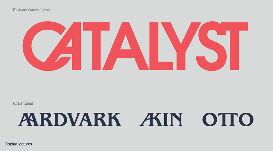
There are others: like the joined oo in New Rennie Mackintosh™, combinations like the CA or ST in ITC Avant Garde Gothic® and the AA, AK, or TT combinations in ITC Benguiat®. that are more contemporary. These, however, are almost always relegated to display copy.
Even complete ligatured logotypes can be included in a font. These are usually short words which have been designed as a complete unit. FF Catch Words™ is a great example of these special characters that can be used with a variety of typeface designs.

Ligatures should be used with care if you plan to adjust the overall letterspacing of the text containing them. Since a ligature is a single character, its internal spacing won’t change when you tighten or open-up letterspacing. In fact, when using extreme tracking, most design applications will replace ligatures, at a certain tracking threshold, with the original single characters to maintain consistent spacing.
Download a pdf version of the Text Ligatures manual.


