
Photo © David Kliewer
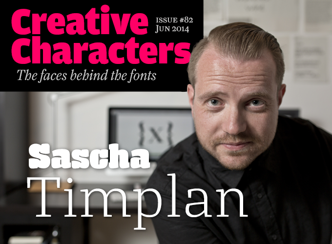
This month’s interviewee comes from a quiet town in Southern Germany best known for its remnants of Roman civilization. His own background is not nearly as classical: a long-time DJ, his introduction to letterforms came in the form of documentary films on hip-hop culture and graffiti. Since joining MyFonts almost five years ago, he has produced a collection of diverse, original and very usable typefaces. But his career, he says, is still young and he has a lot to learn. Meet Sascha Timplan of Stereotypes — modestly ambitious.
|
You live and work in Trier in Southern Germany, near the French border. What is that region like, from a typographic point of view? Trier certainly isn’t a major center of graphic design and typography. There are a few medium-sized agencies with regional and national clients; and there’s a number of independent graphic designers who I think make the most graphically interesting work. When looking for classical graphic design, I’m afraid that Trier is a kind of “hinterland.” For typography and type design, the situation is even less impressive: I’d say I’m one of the very few specialized typographers. For those who come to study here, the situation is rather different. Trier University of Applied Sciences offers a very good design curriculum. Andreas Hogan, the Professor of Typography under whom I studied, can be relied upon to stimulate students and give them new ideas. Typographic education here is on a very high level. France is around the corner, but my knowledge of French is almost non-existent; so unfortunately I rarely extend my antennas towards the west. Looking at the greater region, there’s also Luxembourg and Saarbrücken, which are a lot more lively. The typographic scene there is small and compact, but that has resulted in a strong network, with a lively exchanges through creative meetings, workshops and lectures. For a while you lived in Berlin, the German capital that has been a magnet for type designers and is now one of the typographic centers of Europe. What brought you to Berlin? In 2008 I had the insane luck to be accepted for an internship at FontShop International, who publish the FontFont type library. I owe them everything that happened in my career, which I consider to be still young; those seven months have been pivotal. My application did not happen in a conventional way. I replied to a tweet by [FontShop’s Marketing Director] Ivo Gabrowitsch and the next week I flew to Berlin to do the job interview. That same evening I received a positive reply, and I had to start working just two weeks later. My training under Ivo and under FontShop’s type productions specialists — Andreas Frohloff, Christoph Koeberlin and Jens Kutilek — has had a big influence on me and encouraged me to stick to my plan to focus on type design for a living. During those seven months I “learned to look”, and gradually began to understand what constitutes good type design. Many people come to Berlin to stay; you decided to return to the south. While Berlin has really become a melting pot in the type design scene in recent years, I have a different mindset and I cannot understand why the whole world wants to move to Berlin. The city is now actually on my list of places I would least want to move to. During my time in Berlin, from February through to August, it was the internship that kept me focused. Compared to a city like Trier, with just 100,000 inhabitants, Berlin’s cultural life has, of course, much more to offer. But while living in the capital, I simply felt I was shrinking. The anonymity swallowed me up completely. After work I preferred to go back to my flat to work on personal projects, rather than to enjoy the city. Here in Trier I have been a DJ for over half of my life alongside my work as a type designer and graphic designer. I also help my best friends operate a small club for underground and electronic music, and for a long time I’ve been organizing small DIY concerts. Thanks to those long years of cultural collaborations I know most of the people here who try to keep alive a small cultural scene, as a response to the more touristic character of the city’s art life — culture in Trier is often exclusively defined in terms of preserving the heritage connected to Roman antiquity for which it is famous. We have this well-developed small network which is always there to support you when problems arise — you always know to whom you can turn. In a city like Berlin, there is an enormous oversupply of freelance graphic designers and a huge pool of musicians and DJs, so the pressure to dance at every party is much higher. It’s definitely not for me — I prefer to have the privacy of a much smaller scene, and to visit dear friends in major cities from time to time. |
St Ryde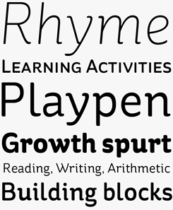
St Ryde joins the ranks of lively yet legible typefaces with rounded terminals (think Fritz, Sauna or Haptic) but has a logic and a charisma all its own. It is a semi-serif rather than a sans; while it swings and bounces at display sizes, it looks more static and regular when used small. With multiple figure sets, small caps and open italics, it was made for serious typographic work, in spite of its unorthodox forms. St Atmos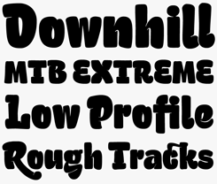
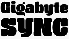
Timplan’s first commercially released typeface, St Atmos owes a great deal to his earliest days drawing letters inspired by graffiti, while displaying a clear understanding of what makes a font different from a simple alphabet of funky, wobbly letters. Fun but also substantial and useful, that cuddly aesthetic is partly down to its exaggerated ink traps which lend it a decidedly 3D effect. |
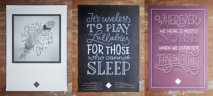
A selection of hand-lettered posters by Sascha Timplan.
|
You studied graphic design. How come you gravitated towards the design of typefaces? Ultimately, it was my love for music that brought me to graphic design. I always had sketchbooks with me and my main interest apart from DJing was graffiti. I only drew on paper, never on walls. I wasn’t able to draw people or cartoon characters, so what was left was lettering. I looked at films like Style Wars and Wild Style, and by pressing the pause button on the VCR, I was able to trace the graffiti in those movies. Later, when I was DJing and organized parties with friends, we needed publicity and so I designed my first flyers in the typical way, using CorelDRAW. I started my design studies very late — I’m a typical case of a career changer — and I immediately developed an interest in type. The sharp contrast between the white and black, and the beauty of a letter in its purest form, that’s pure eroticism for me and among the most beautiful things I know. Perfect curves and the path tool are as relaxing as the musical weekend program. I currently cannot imagine doing anything else. In our first semester, we had to draw an experimental set of five characters; in the third semester we were even asked to design our own small display font. The font bug caught me immediately. I could not let go, and since I’ve spent almost every day getting to grips with FontLab. How do you decide what projects to work on? Do you like doing type design for clients? I feel I’m still in the early stages of my career, so I can’t say much about that yet. I love supervising or carrying out projects involving custom-designed typefaces, but unfortunately that hasn’t happened very often yet. It’s been changing a little recently: I’ve been contacted directly a few times for type-related assignments which, among other things, resulted in the recent Sarre family. The idea was to create a font for the new corporate design of the Saarland region for a pitch in cooperation with Saarbrücken agency Haag-Marketing. We did not win, but the typeface was in a rather advanced stage, so it was a logical step to complete it. I expanded the family and drew an open, condensed, friendly typeface that, with its abrupt ductus changes in its counterforms is reminiscent of writing with a quill, yet is down-to-earth and modern. Other than that, I’m still experimenting, and in addition to any assignments, I tackle projects that I have fun with. On my hard drive there are at least thirty or forty ideas I would like to develop and I’m constantly adding new ones. I feel that all my fonts from the early years belong in the category of display faces. Now, hopefully, the time has come to design more text fonts or type systems such as my new Christel, which I’m really proud of. Which designers and artists have influenced or guided you during your formative years? Do you have any heroes? Far too many! I love the variety of type designers that are currently active, and have a lot of respect for their work. Almost all fonts by Alejandro Paul are really hot — I know I will never reach that kind of level in script fonts. Time and again I find myself admiring the wealth of unconventional ideas of type designers like Yanone, Bold Monday, Underware or Typejockeys. It took me several years to get a grasp on text fonts and to gradually begin to understand how beautiful they can be. In recent years I have intensively explored the work of older masters such as Bram de Does, Albert Kapr or Gerrit Noordzij. As you can see from these names, I have a strong affinity with the Dutch school of type design. So, yes, I’m still considering doing the Type and Media Master’s in Type Design at the KABK in The Hague. What new skills or knowledge do you hope to gather from a specialized program like that? Learning to write! My skills in calligraphy and in working with various writing tools come up short in my work. That’s why, when working on my final project, I deliberately refrained from drawing yet another font. The work of lettering artists such as Ken Barber, Herb Lubalin, Doyald Young or also Martina Flor shows how much time you have to invest to produce perfect typographic illustrations. The last few years I’ve gradually realized that I feel more at home in conventional type design than in lettering or illustration; nevertheless I think it’s important to study those fields as well, and carry over those experiences to the type design work. Other than that, my knowledge of the automation of design processes is negligible; my guard goes up whenever someone mentions the word Python (the scripting language used for font design in The Hague). So these are some of my biggest weaknesses. Drawing: yes, scripting or programming: no. I find all of these points interesting, and learning about them will certainly help me in my future work. What’s even more important is to get to know new people with the most divergent views, and build a larger network for later. Besides, I have a huge appreciation of the Dutch school, and I have looked up to the teachers in The Hague for many years. |
Christel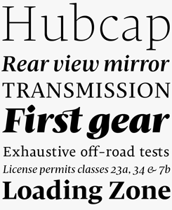
Finalized just in time for this newsletter, Christel is Timplan’s most serious text face so far. It betrays his admiration for the Dutch school of type design: like the text type designs by, say, Gerard Unger it strikes a balance between traditional principles and contemporary detailing, between personality and functionality. Sarre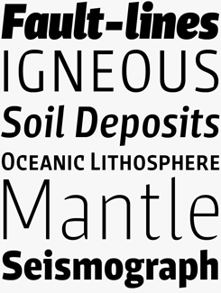
While in some respects Sarre is reminiscent of Amplitude, it is very different and very personal in its finer features. There’s a smart game going on of pronounced contrasts and sharp ductus changes, lending a striking personality to large headlines and a briskness to small text settings. The typeface is rather narrow for a text face, so settings should be medium-sized. Small caps, real italics, and multiple figure sets are all in place. St Marie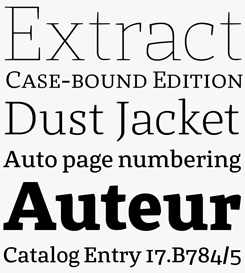
St Marie is a vivacious mixture of old-style proportions and slab-serif detailing, resulting in a clear and contemporary text and display face for use in newspapers, books and any other printed media, as well as on-screen publications. The typeface comes as an upright only (the italic is still in the making) but is well-equipped: eight weights, small caps and various styles of numerals. |
|
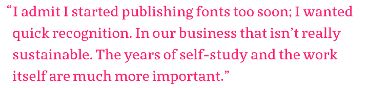
Do you think every young type designer who takes herself or himself seriously should do a specialized Master’s in type design? As in most creative disciplines, a long period of self-study in type design is almost inevitable. The digital tools are now a lot more accessible than 20 years ago, and it is possible for anyone to publish a typeface. It is similar with DJing — there are many parallels in fact. But collecting a large digital library of songs and downloading a mixing program doesn’t turn you into a DJ. Today’s rapid technological developments facilitate entry into many industries, but if you want to persist, you have to work on yourself every day. It’s the school of hard knocks. To conclude: yes, I’d say that anybody who aims to deal with type design professionally in their future should consider enrolling in a specialized type design program. In my opinion, to learn only by teaching yourself is too limiting. Many people still start out as self-taught type designers. Do you think they often start publishing fonts too early? Yes, most definitely. I myself am one of the best examples of this. It was in fact the success of another student’s font that challenged me to start publishing: Sketch Block by Lukas Bischoff. Lukas also studied in Trier, and the immense success of that typeface provoked me; I also felt a kind of envy. Don’t get me wrong: I don’t begrudge him his success, he is a good designer and a great guy and we regularly work together successfully at the computer, the foosball table and at our favorite bar. So I admit I started publishing fonts too soon; I wanted quick recognition. In our business that isn’t really sustainable. The years of self-study and the work itself are much more important. You should ask yourself in which segment you feel at home: are you excited by the idea of a quick buck, or do you care more for long-term (and not necessarily financial) success and recognition in the type scene? When looking at your achievements so far — which of your fonts are you happiest with? I like almost all of them, although I have recurring doubts about my earliest releases and would perhaps prefer to take them out of the program — which takes us back to the subject of premature releases. Of course, I am currently proudest of my latest child, Christel (named after my grandmother) because I think it is currently my most accomplished type family. Some of the weights are very lucid and open, having been design specifically for body text; this is reflected in the more generous width and the long extenders. The display styles have a totally different stroke contrast and are spaced a lot more closely. I did my first offset press test with it five months ago, having set a subcultural DIY magazine in Christel, and I was very happy with the result. In addition, I held a small presentation for Hermann Schmidt Publishers and managed to convince them, and editor Raban Ruddigkeit, to use the type family in the forthcoming book Freistil 5. |
Florence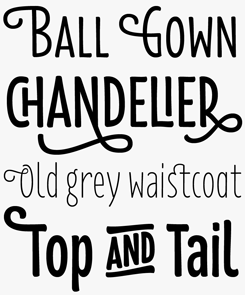
With its casual curves, narrow width and striking swirls, Florence finds a niche for itself between a skinny hand-drawn aesthetic and informal humanist sans. The ornamental additions make this a great typeface for setting alongside rich pictorial content, yet it will work just as well if it has the canvas to itself. Leave the ornaments aside, and Florence will make for charming and individual short to medium length texts on posters and covers. |
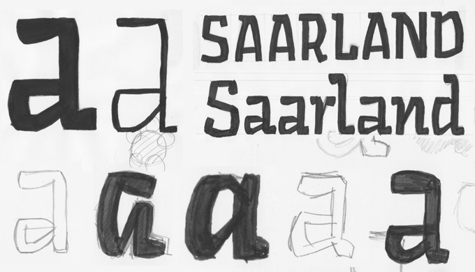
Development sketches for the Sarre typeface, which began life as a corporate commission for the Saarland region.
|
How long does it take you to design a font family? How do you decide when to stop working on it? I am still inclined to decide too soon to release a typeface, and should work on each font family a bit longer. So far, it has always been pure gut feeling: at some point you feel you can’t improve much or you fail to see your own mistakes. But in general, you always have several typefaces on your to-do list, so after working on a font family for some time, you can decide to leave it alone for a while and turn to a different project. For each of my typefaces, there are several resting phases where I ignore them for a while. This allows me to distance myself from it a little, which is important because each time I discover mistakes I made. The time spent on a typeface can be very different each time. Working on a larger type family may take as much as six months or longer; smaller assignments can be produced in maybe 2 to 4 weeks. During my internship at FSI, the head of the Type Department, Andreas Frohloff, introduced me to the Pareto principle, which I did not know. It comes down to the insight that the first 80% of any project gets completed in 20% of the time, and then you spend, unfortunately, 80% of the time on 20% of the work. I have often found myself exactly in this scheme and as a type designer you have to decide for yourself, at which point the moment has come to merge components, remove overlaps, or to take care of the technical preparation of the font. You have several unreleased fonts on your website, and a drawer full of ideas. What is the most exciting future project for you? Tough question. I’m currently working on a major update of my type families Ryde and Marie, giving Marie an italic, finally: she’s growing up. But rather than just talking about type design, I prefer to answer the question in terms of life planning. I am looking at possibilities to start teaching. My dream has always been to be a Professor at forty. I’m not quite sure if I will still manage to achieve that goal — I’ve got another five years. As you have already read, my creative output spans multiple fields. We want to start up a music label, there is a lot of work at the club and I’ve been getting more active in making and producing music — although the only instrument that I can play well is the turntable. Life, love, friends & family are the important projects in life, and I do still have a few small construction sites in these departments. Nothing is more important than friendship. Not money. Not fame. Thank you. Thank you, too. Good luck with all your construction sites, typographic and otherwise. |
Flenja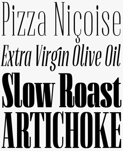
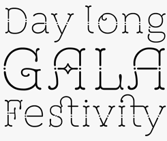
Flenja is a highly compressed transitional typeface; Timplan’s interpretation of narrow nineteenth-century poster types with their strong vertical stress. Its lighter weights have a clean-lined elegance while there is a more square jawed ruggedness as it gets heavier. With seven weights and matching italics, Flenja will appeal to anyone wanting to create compact newsprint or bill-poster flavored layouts. Prism
Inspired by Rudolf Koch’s sketches for Prisma and informed by Herb Lubalin’s Avant Garde Gothic, Prism is a precisely drawn headline face in ten varieties, ideal to achieve a spot-on 1970s disco look — we recommend an orange-and-brown color scheme. |
MyFonts on Facebook, Tumblr & TwitterYour opinions matter to us! Join the MyFonts community on Facebook, Tumblr and Twitter — feel free to share your thoughts and read other people’s comments. Plus, get tips, news, interesting links, personal favorites and more from MyFonts’ staff. |


|

|
Who would you interview?Creative Characters is the MyFonts newsletter dedicated to people behind the fonts. Each month, we interview a notable personality from the type world. And we would like you, the reader, to have your say. Which creative character would you interview if you had the chance? And what would you ask them? Let us know, and your choice may end up in a future edition of this newsletter! Just send an email with your ideas to [email protected]. In the past, we’ve interviewed the likes of Matthew Carter, Laura Worthington, Jonathan Barnbrook, Ulrike Wilhelm, Bruno Maag, Veronika Burian, and Hannes Von Döhren. If you’re curious to know which other type designers we’ve already interviewed as part of past Creative Characters newsletters, have a look at the archive. |
ColophonThis newsletter was edited by Jan Middendorp and designed using Nick Sherman’s original template, with specimens by Anthony Noel. The Creative Characters nameplate is set in Amplitude and Farnham; the intro image features St Mika and St Marie Light; the pull-quote is set in St Marie DemiBold; and the large question mark is in Farnham. |
Comments?We’d love to hear from you! Please send any questions or comments about this newsletter to [email protected] |
Subscription info
Had enough? Unsubscribe immediately via this link: Want to get future MyFonts newsletters sent to your inbox? Subscribe at: |
Newsletter archivesKnow someone who would be interested in this? Want to see past issues? All MyFonts newsletters (including this one) are available to view online here. |