Best Fonts for TikTok

TikTok is about getting your message to as many viewers as possible. The right fonts can go a long way toward reaching a large audience – and even making your videos go viral.
Tips to Follow for Choosing a TikTok Font
Legibility
The font you choose should be legible – especially on mobile devices. (Sans serif fonts like Helvetica Now® and Avenir® Next tend to be the best.) Avoid overly decorative or complex fonts that may be difficult to read at a glance. Stick to clean and legible fonts to ensure that your message is clear to viewers.
Readability
Readability is a relative gauge of how easily words, phrases and blocks of copy can be read. Many things can affect readability. There are a few areas, however, which require the most attention.
Type Size
Keep text sizes generous – with extra line space to increase readability. A minimum of 12 point text with 14 points of line space is a good rule of thumb, although exact sizes can vary depending on the typeface. The right type size is appropriate to application and to reader. If your audience has to make an effort to read the copy – they won’t.
Copy Blocks
Avoid long blocks of text. Break copy into “snackable” chunks wherever possible. The ideal number of words in a TikTok video copy block is around 10 to 20 words. This length is effective for delivering a brief message that engages viewers quickly. Keep in mind that TikTok’s format emphasizes short and snappy content.
Animation
Don’t animate copy. The result will difficult to read because movement and changing visual elements almost always creates distractions, making it difficult for the viewer to focus on the message. The faster the animation, the more distracting it is.
All-Capital Copy
Capital letters do not combine as well with each other as do lowercase characters. And are harder to read. If you need to set words in all capitals, adding a little extra letterspace will often make copy more readable.
Font Color and Weight
Ensure that the font color and style contrast well with the background. Use bold and highly legible fonts over fast moving videos, dark and complicated backgrounds.
Branding
If you’re creating content for a personal brand or business, it’s essential to use fonts that align with your brand identity. Consistency in font choice across content helps establish brand recognition and reinforces your brand’s visual identity.
Relevance
The font you select should match the tone and style of your video content. For example, playful and lighthearted videos may benefit from bubbly and fun fonts, like ITC Ziggy and ITC Souvenir while more serious or informative content may call for clean and professional typography set in fonts like Egyptian Slate or Trade Gothic Next.
Fonts for balloon copy should be casual, like ITC Stone Humanist and ITC Kristen, while fonts for captions should be straightforward and easy to read, like Helvetica Now and Neue Frutiger.
Hierarchy
If you have a lot of font content in your videos, it is essential to maximizing the likelihood of content being read and understood. The following factors contribute to developing an effective typographic hierarchy: font style, font size and color.
Test Your Fonts
It is always best to test your fonts before licensing them. My fonts provides a “Type Tester” that allow you to set a few words in any of its fonts, as well as change font and background color.
Best Fonts for TikTok Videos
The following fonts, carefully selected by the MyFonts font experts, are the best for TikTok videos.
Sans Serif Fonts
Sans serif fonts are modern, clean, and easy on the eyes. Their simple shapes are ideal for digital displays.
Helvetica® Now
Helvetica Now is the latest iteration of the Helvetica font, representing a significant advancement over its predecessors. This classic font has been reimagined for the 21st century and is exclusively accessible via MyFonts and its network of font providers. With its exceptional legibility and eye-friendly appeal, Helvetica Now can be perfect for TikTok videos.
Foundry: Monotype
Perfect Pairs:
ITC Galliard® (Set in roman weight)
Ionic No 5 (Set in regular weight)
DIN® Next Slab (Set in medium weight)
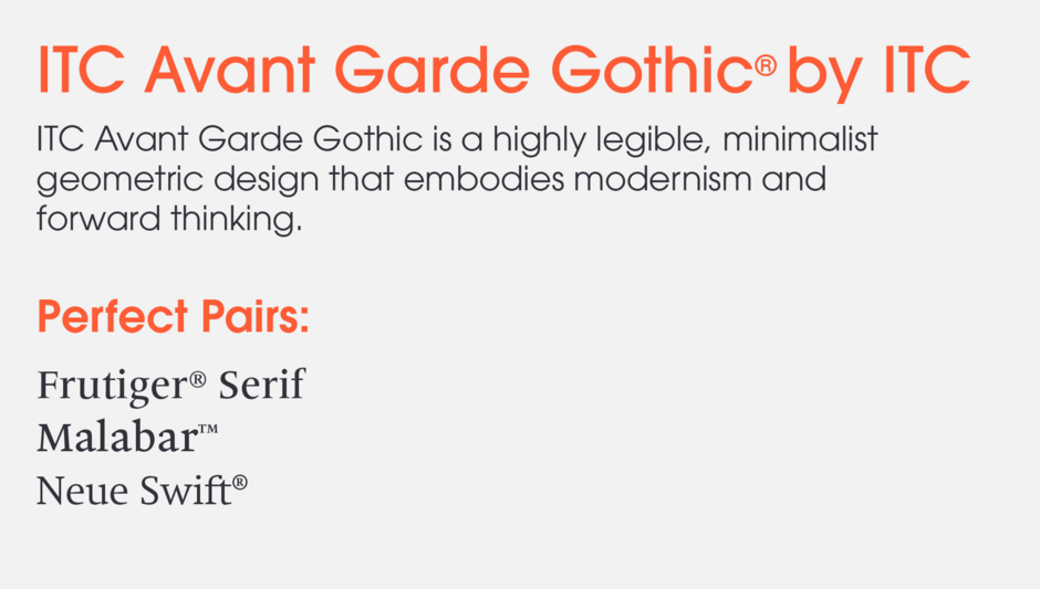
ITC Avant Garde Gothic®
ITC Avant Garde Gothic is a highly legible, minimalist geometric design that embodies modernism and forward thinking.
Foundry: International Typeface Corporation
Perfect Pairs:
Frutiger® Serif (Set in medium weight)
Malabar™ (Set in regular weight)
Neue Swift® (Set in light weight)
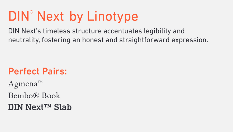
DIN® Next
DIN Next’s timeless structure accentuates legibility and neutrality, fostering an honest and straightforward expression.
Foundry: Linotype
Perfect Pairs:
Agmena™ (Set in roman weight)
Bembo® Book (Set in roman weight)
DIN Next™ Slab (Set in roman weight)
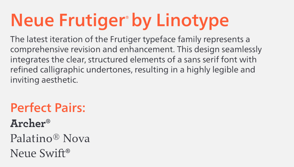
Neue Frutiger®
The latest iteration of the Frutiger typeface family represents a comprehensive revision and enhancement. This design seamlessly integrates the clear, structured elements of a sans serif font with refined calligraphic undertones, resulting in a highly legible and inviting aesthetic.
Foundry: Linotype
Perfect Pairs:
Archer® (Set in bold weight)
Palatino® Nova (Set in regular weight)
Neue Swift® (Set in light weight)
Serif Fonts
Serif fonts are some of the most traditional designs and evoke feelings of steadiness, longevity, trustworthiness and a sense of authority.
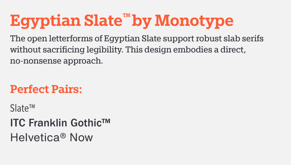
Egyptian Slate™
The open letterforms of Egyptian Slate support robust slab serifs without sacrificing legibility. This design embodies a direct, no-nonsense approach.
Foundry: Monotype
Perfect Pairs:
Slate™ (Set in regular weight)
ITC Franklin Gothic™ (Set in medium weight)
Helvetica® Now (Set in Helvetica Now Text Regular)
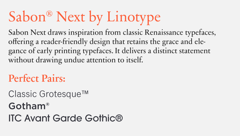
Sabon® Next
Sabon Next draws inspiration from classic Renaissance typefaces, offering a reader-friendly design that retains the grace and elegance of early printing typefaces. It delivers a distinct statement without drawing undue attention to itself.
Foundry: Linotype
Perfect Pairs:
Classic Grotesque™ (Set in regular weight)
Gotham® (Set in medium weight)
ITC Avant Garde Gothic® (Set in medium weight)
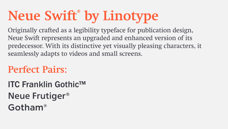
Neue Swift ®
Originally crafted as a legibility typeface for publication design, Neue Swift represents an upgraded and enhanced version of its predecessor. With its distinctive yet visually pleasing characters, it seamlessly adapts to videos and small screens.
Foundry: Linotype
Perfect Pairs:
ITC Franklin Gothic™ (Set in medium weight)
Neue Frutiger® (Set in medium weight)
Gotham® (Set in medium weight)
FF Kevitt Slab
FF Kevitt Slab is distinguished by its exceptional legibility, characterized by clear and distinct letterforms, balanced proportions, generous spacing, and optimal stroke contrast. These features guarantee effortless reading and comfortable comprehension, particularly in digital contexts.
Foundry: FontFont
Perfect Pairs:
Classic Grotesque™ (Set in regular weight)
FF Kievit (Set in regular weight)
FF Kievit Serif (Set in regular weight)

Script Fonts
Script and handwriting and fonts add emotional depth and passionate expression to TikTok videos. These designs communicate with soul, heart, and a compelling message. Explore the links to experience these fonts in action.
Nadianne™ Script Font (Set in medium weight)
Snell Roundhand® Script Font (Set in bold weight)
Handwriting Fonts
Handwriting fonts are distinctive, evocative, and visually appealing, encompassing a wide typographic range from sweet to edgy, from calm to energetic. They can be very expressive and inviting, but be sure that they are also legible at small sizes on digital screens.
Blueprint™ Handwriting Font (Set in bold weight)
ITC Bradly Hand™ Font (Set in bold weight)
Escript™ Handwriting Font (Set in bold weight)
Teebrush Paint™ (Set in Roman design)