Manual: Typographic Hierarchy
One of the most important aspects of communicating with type is to establish a strong typographic structure. It establishes a clear hierarchy, that communicates information clearly and conveys meaning. It allows for easy scanning and comprehension, emphasizing key messages, and distinguishing between different levels of information.
This organizational system, or roadmap, is achieved through the use of both typographic and spatial elements. The following factors contribute to developing an effective typographic hierarchy:
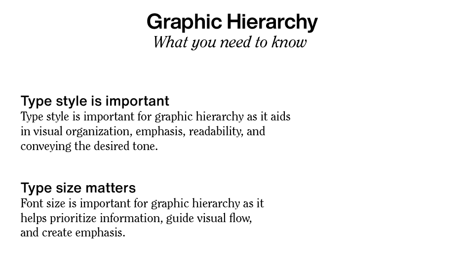
Type Style
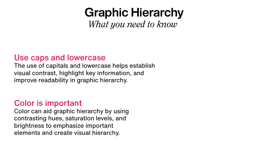
Typeface and weight play a key role in establishing typographic hierarchy, especially for headlines and subheads. Bold (and in some instances very light), decorative, or more distinctive typestyles command attention and convey importance.
Type Size
The viewer’s eye is usually drawn to the largest-sized type first (which is usually, but not always, the headline), and then moves on to other elements. Although headlines most commonly appear at the top of a page, this is not a requirement. A well-designed page will guide the reader to the headline and other important elements no matter where they are located.
Color
The use of color can either draw attention to – or deemphasize an element. Red type on a page with mostly black text will instantly stand out, while making a less important element gray amidst black text will downplay it. Remember that too much color used in too many instances can create visual confusion, which undermines its effectiveness.
Case
The use of all caps in small doses can be an effective way to draw attention and signify importance, particularly for headings or subheads. Just be aware that all caps have reduced readability, so using upper and lowercase is preferable for lengthy settings and contextual copy.
Placement and Spacing
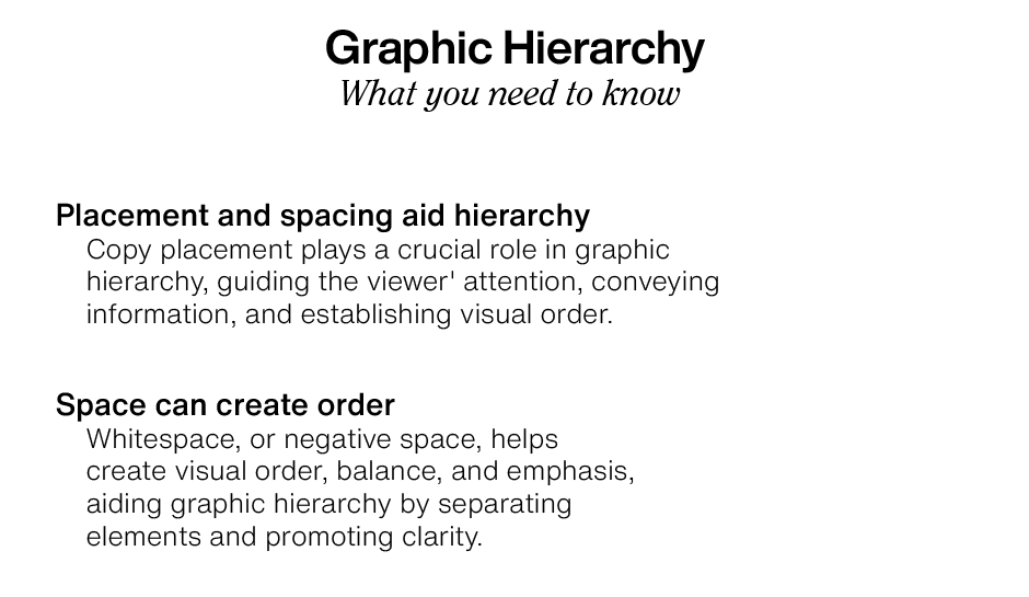
The placement of all elements, as well as the space between and around them, is part of the overall hierarchy. Keep the most important information prominent. Place all related elements together, while visually separating others to organize the content.
Alignment
How elements are aligned can imply their relative level of significance. Centering usually conveys a sense of importance, and is frequently used for titles, headlines, announcements, and invitations.
Whitespace
Use whitespace, or negative space, to create emphasis and draw attention to important elements. Too many elements on a page, which can create “visual noise” and confuse or fatigue the viewer.
A strong design provides visual cues to lead the viewer through the content. Good typographic hierarchy is essential to maximizing the likelihood of content being read and understood.


