|

|
|
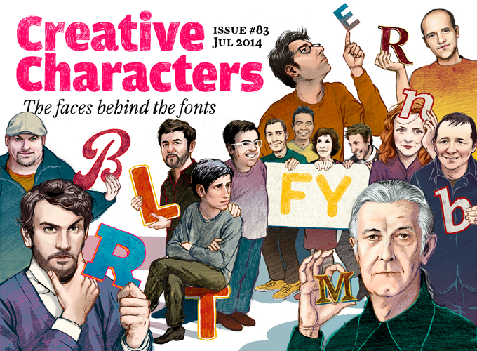
Illustration © Bea Davies This month we’re doing something a bit different. The designers and foundries we interviewed over the last twelve months haven’t stopped creating wonderful new typefaces just because they achieved the pinnacle of their careers — a MyFonts Creative Characters interview (at least that’s what we like to think!). So here’s a round-up of what some of our recent interviewees have been up to since we spoke |
Rui Abreu | Issue #72, August 2013 | Original Interview [↗] |
|
|
Nearly a year ago we interviewed Rui Abreu, a versatile designer originally from Porto, Portugal. Not only is Abreu a designer of highly original, exquisitely crafted typefaces — he is also an experienced graphic designer, animator and video maker. Among his side projects is a series of splendid videos he designed and directed to accompany his typeface releases, worth checking out on Vimeo. He released several of his most striking faces through Fountain, the Swedish company founded by Peter Bruhn, who sadly died in February of this year. Abreu also runs his own one-man label, operating from Lisbon.
|
|
Aria Text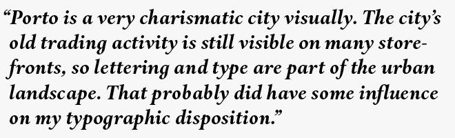
Aria Text, Rui Abreu’s latest typeface, is a beautifully drawn text family — drawn in the tradition of oldstyle book faces but with a very contemporary poignancy and dash. Based on his wonderfully baroque display family Aria, Aria Text has been fine-tuned for use in book typography. It’s a sturdier and somewhat simplified variation on the same theme. The mannerisms of the display version have been tamed — the extreme contrast, the angle of the italics, the exuberant detailing. The result is still very appealing, but more modest, transparent and readable. The text family comes in three varieties, optimized for various uses and sizes: G1 is for subheads, G2 for normal text sizes and G3 for footnotes and captions. |
|

Fontyou | Issue #73, September 2013 | Original Interview [↗] |
|||
Fontyou is the largest group we ever interviewed — there were ten of them in the picture we published, and new designers are signing up constantly. The Paris-based collective is going where no foundry has gone before. Their aim is to design and produce fonts collectively by bringing together people with complementary skills — lettering artists, type designers, font technicians, and more — using their own online tools. They’re now into their second year, and the initiative is wildly successful. In the ten months since we interviewed them, they produced an average of four typeface families a month, many of them based on ideas, sketches and mature designs from creatives out there, somewhere in the world. The quality bar is high, the styles extremely varied, the fonts attractive and often quite original. In other words, Fontyou is working. |
|
||
Marianina FY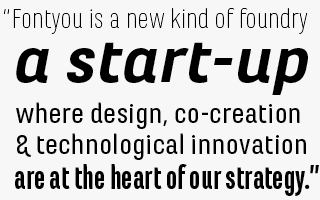
Marianina FY is big. First there was Marianina FY (Normal and Condensed), then came Marianina Extended FY (Wide and X-Wide). The resulting family, or suite, consists of 48 fonts, most of which are condensed, narrow or compressed. As narrowness is the basic principle of this family, even the so-called Wide styles are rather vertical alphabets, best used to create compact, space-saving headlines or short, medium-sized body texts. |
Suzee FY & Booster Next FY
It wasn’t easy to choose from the avalanche of new type families Fontyou released during the past months — so we’re presenting two at once in this slot. Suzee FY is a well-drawn connected brush script with energetic angularity. Booster Next FY is a very nice, rounded sans-serif display face in six weights. The simplicity of the latter combines well with the pizazz and sweep of the former. |
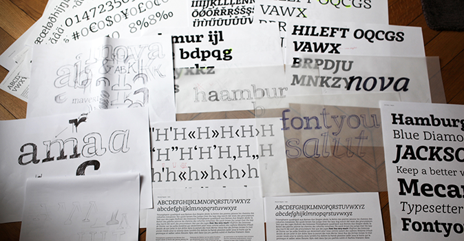
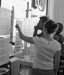
A selection of Fontyou’s work-in-progress sketches and proofs |
|
Matthew Carter | Issue #74, October 2013 | Original Interview [↗] |
|
|
We spoke to Matthew Carter in Amsterdam during the 2013 edition of the annual typographic conference ATypI. Having designed typefaces like Verdana, Georgia, Tahoma, Miller and Bell Centennial, Carter is definitely among the most widely read type designers in the world. His work is all across the stylistic spectrum, from elegant renaissance oldstyles via meticulous scripts to indestructible sans-serifs. Having started out cutting metal punches as an apprentice at age 19, Carter progressed through subsequent technologies for the best part of six decades. As active as ever, at 76 he is still passionately interested in the challenges and possibilities of changing font technologies. And he doesn’t even dream of retiring — Matthew Carter just enjoys his work too much to take it easy. |
|
HWT Van Lanen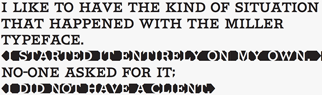
In 2002 Matthew Carter was commissioned to create a new design to be cut in wood by the then nascent Hamilton Wood Type Museum. Amazingly, wood type was the only technology for which Carter had not yet designed type. The new design emerged as a two-part chromatic type to be cut specifically in wood. Originally called Carter Latin, the font was renamed Van Lanen after one of the Museum’s founders. While the original wood type version of the type has been on sale through the Museum since late 2009, it has (understandably) been bought only by a happy few. The digital version of the Van Lanen fonts is now available from the Hamilton Wood Type Foundry, a joint venture of the Museum and P22. The design recalls antique Latin wood type, but with a refined sensibility and intentional quirks. A wonderful addition to Carter’s impressive body of work. |
|

Eduardo Manso | Issue #75, November 2013 | Original Interview [↗] |
|
|
Speaking of the ATypI conference: it takes place in Barcelona this September and one of the organizers is Argentinian designer Eduardo Manso, who has been living there for many years. Manso is not one of those type designers who produces a new font family every two or three months. Each of his typefaces has taken considerable time to mature, each is thoughtful, original and well-wrought. His Emtype Foundry produces typefaces that have impressively long shelf-lives; Geogrotesque is a persistent presence on MyFonts’ bestseller charts. His most recent typeface, introduced below, is even more rectangular — but certainly not square.
|
|
Shentox
“During a visit to London,” wrote Manso, “I fell in love with the square typeface used on British car number plates. I was immediately inspired to start working on this font and have been developing it intermittently ever since.” After several more trips to the UK, the project gradually evolved into a complete family — Shentox. While its starting point was a simplified alphabet of capitals, the font family soon grew to become something more sophisticated and rich in detail. Even though the square genre is very restrictive, Shentox is highly legible, with a full range of weights, usable not only as a display family for headlines and posters, but as a distinct, clean font family for branding and editorial use. For a typeface in this genre, it has a remarkable fluid italic, which makes it all the more usable in longer texts. |
|

Charles Borges de Oliveira | Issue #76, December 2013 | Original Interview [↗] |
|
|
Charles Borges de Oliveira of Borges Lettering was trained in hand-lettering, right at the time when that craft was beginning to become obsolete. While passionate about calligraphy and sign painting, he loves working with digital design tools. He has drawn custom logos and titles for prestigious companies. He has produced a string of successful font families, of which the most successful — Desire — took him an estimated 7,000 working hours. He was a mentor to fellow lettering artists Laura Worthington and Debi Sementelli, both of whom he helped to perfect their digital skills. He loves building bridges between hand crafts and digital savvy. An interesting example of this is the really nifty set of Actions for Adobe Illustrator which he recently released. Ideal for art directors and branding designers who like customizing the fonts they buy, adding shadows, shadings and more. |
|
Chicago Script
Chicago Script is one of the typefaces Borges published through Letterhead Fonts, a library of typefaces based on a wide array of tasty American display styles. Part Spencerian script, part 1960s hippie culture, Chicago Script is great for making a strong visual statement without dictating one single direction: it is stylistically ambiguous enough to fit in with different atmospheres and different contexts. As shown in the poster designs on the Chicago Script font page, it combines very well with other typefaces or with exuberant ornament and illustration. Chicago Script takes full advantage of OpenType, with automatic ligatures that occur as you type. Manual stylistic alternates allow users to pick their favorite version of each letter. 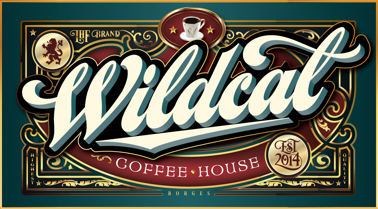
One of Borges’ promotional posters for Chicago Script. |
|

Latinotype | Issue #77, January 2014 | Original Interview [↗] |
|
|
In only a few years, Latinotype has become a key player on the Latin American typographic scene, and quite probably the most influential type-related company in their native Chile. They’re also one of the most successful foundries on MyFonts in recent years. Latinotype specializes in colorful display and script faces, but have recently produced several font families, too. The company is owned and managed by a trio of designers, two of whom have the same family name but are unrelated: Miguel Hernández, Luciano Vergara and Daniel Hernández. Yet they have worked with about a dozen talented designers and hope to welcome more. There production schedule is well-organized and precisely timed; so since we interviewed them in January, their library has seen some remarkable growth. |
|
Showcase
Showcase by Daniel Hernández and Paula Nazal Selaive is a smart kind of display family. Its styles are a mixed bunch: a script, a sans-serif, a slab, a sans mini (think small caps) and finally a set of ornaments and dingbats. Designed to mix well and work together in perfect harmony, they speak the same visual language but with very different nuances. The result is a versatile and easy-to-use typographic toolkit. |
D Sari
D Sari presents an eclectic mix of references: it has the friendliness and familiar feeling of a neo-humanist sans; the rounded terminals add a soft and cuddly feel. With eleven weights plus matching italics, the family is extremely versatile. Stylistic alternates (to be used with OpenType-enabled software) give the user an additional, unconventional style within each font — almost like being given a second typeface for free. |
The Northern Block | Issue #78, February 2014 | Original Interview [↗] |
|
|
And then there were two… Having run The Northern Block on his own for six years, Jonathan Hill found a working partner in Mariya Pigoulevskaya. On a visit to Northern England, Pigoulevskaya, originally from Belarus, fell in love with the region’s cultural and industrial heritage. The two of them met through a common friend, and it soon turned out they complemented each other perfectly. He specializes in cool, clean sans-serifs, she’s added more historical references as well as frivolousness to the Northern Block’s type library. |
|
Bitner
Bitner is a contemporary sans-serif with simple, spurless letterforms that give the font a distinct, modern personality. These compact details combined with open apertures provide good readability in headlines as well as body copy. Details include over 800 characters, with alternative lowercase a, e, g and y. Seven variations of numerals, true small caps with accents, manually edited kerning and OpenType features. |
Tautz
Of several new font families at The Northern Block, Tautz is currently the most successful. Which is a bit of a surprise, as it is so unorthodox — but perhaps that is exactly what makes it attractive to many users. This contemporary take on the humanist serif is Pigoulevskaya’s attempt to capture “Britishness” without falling into the trap of stereotyping. Tautz is a personal experiment resulting in a text and display typeface that is both functional and whimsical. |
RenÉ Bieder | Issue #80, April 2014 | Original Interview [↗] |
|
|
René Bieder is one of several dozen designers working in Berlin today who manages to make a living out of type design. Having specialized in the art of the alphabet only recently, Bieder’s production and public success have been phenomenal. Two of his font families made our 2012 and 2013 lists of Fonts of the Year. He hasn’t brought out a single family yet that has not become a major seller. His designs are powerful, functional and well-made. His latest typeface Choplin, released just weeks after the interview, jumped to the top 3 of our Hot New Fonts list without delay. And like his previous typefaces, it seems to be exactly what the graphic design world was waiting for. |
|
Choplin
Less than four months after his sans-serif Campton, Bieder released another extended family. Choplin, a sturdy slab serif, was designed on Campton’s skeleton. It shares the same principles: geometry, simplicity and neutrality, but it is not simply Campton-with-serifs-snapped-on. Many details were changed during the process in order to sharpen the slab serif character. While the middle weights work well in longer texts, the lightest and boldest weights make headlines look loud and strong. |
|
|